Social Media
3 min read
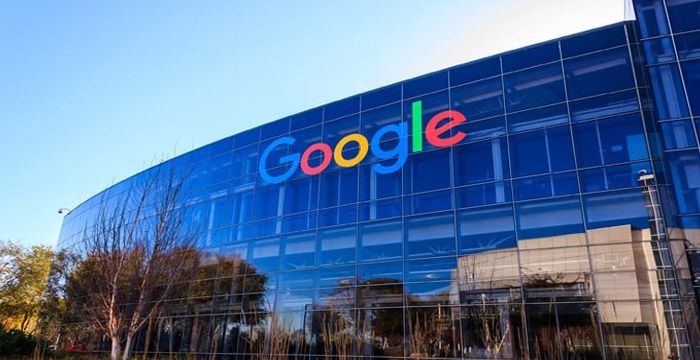
Google has quietly updated its “G” logo — the four-color circular symbol that appears across its apps and services — marking its first major design revision in nearly a decade. The change, while modest at first glance, is a part of a broader visual update gradually rolling out across select platforms.
Founded in 1998 by Larry Page and Sergey Brin, Google began as a research project at Stanford University before becoming a search engine aimed at organizing web information more efficiently than existing tools. Over the next two decades, the company expanded into email, navigation, operating systems, productivity apps, and more, all under the same corporate name.
In September 2015, Google introduced a major visual rebrand. This included a new wordmark in a sans-serif font and the now-familiar “G” logo composed of four color segments: blue, red, yellow, and green. That logo has remained unchanged for nearly 10 years.
The newly updated logo retains the same circular “G” shape and four-color palette. However, the most visible change is the shift from solid colors to a smooth gradient, where each segment now transitions gradually into the next. The overall structure remains familiar, but the gradient adds a softer and more blended appearance.
There are no additional elements, no new symbols, and no changes to the word “Google” itself. The update appears to be strictly visual.
The updated “G” logo has started appearing in select areas, though it has not yet been rolled out universally. Users have reported seeing the new design in the Google Search app on iOS, on some Pixel devices, and within the beta version of the Google app for Android. The change is being introduced gradually, so many users across other platforms may still be seeing the older version for now.
The reason for the logo change has not been explicitly detailed in any official announcement. However, industry observers note that such updates often correspond with shifts in a company’s visual strategy or product direction. The introduction of gradients aligns with broader design trends, but no functionality has changed as a result of the update.
Online responses have been mixed. Some users noted the difference immediately, while others had to compare screenshots to detect any change. The subtle nature of the update led to light commentary on social media, but no major controversy or backlash.
The new “G” logo marks the first update to Google's branding icon since 2015. While small in appearance, it reflects an ongoing effort by the company to keep its visual identity in line with contemporary design norms. No additional product changes have been reported in connection with this redesign.
Be the first to post comment!
Writing captions consistently is one of the most underestimated challenges in so...
Sakshi Dhingra1 week ago

Starting a YouTube Shorts channel in 2026 is no longer about simply uploading ve...
Sakshi Dhingra1 week ago

Artificial intelligence has quietly moved from being an optional productivity en...
Sakshi Dhingra2 weeks ago

Whitney Scott Mathers, today known as Stevie Laine, is one of the most discussed...
Sakshi Dhingra3 months ago
Introduction: Why People Want to Download Instagram StoriesInstagram Stories are...
Parveen Verma4 months ago
TikTok has its own secret language, and no, we’re not just talking about inside...
Sakshi Dhingra5 months ago