In today’s digital world, communication is often overloaded with text. Reports, research, and project notes can stretch into dozens of pages. Many businesses and individuals claim they struggle to make this content engaging. Tools like Napkin AI have emerged as a possible solution, converting written text into structured visuals that are easier to absorb. Suppose someone has limited design skills; they may still be able to create diagrams, infographics, or mind maps in seconds. This leads naturally to the next question—how does Napkin AI actually work in practice?
Anyone who has dealt with long emails, strategy papers, or academic notes knows the pain of information overload. Instead of expecting people to read line after line, Napkin AI claims to automatically generate visuals like flowcharts and concept maps from plain text. The output may not always be perfect, but it tends to highlight core relationships and key themes more effectively than a wall of words. This simplification, in turn, links directly to the time factor, because generating visuals usually consumes hours otherwise.
Creating slides or diagrams often requires software like PowerPoint or Canva. But many users say such tools demand manual design work, dragging productivity down. Napkin AI’s process is said to be much faster — a user pastes in text and gets a structured image almost instantly. Suppose a project manager has to present a workflow within an hour; a tool like this reduces preparation time drastically. Yet time-saving is not the only barrier professionals face; non-designers also struggle with presentation quality, which leads us to the next concern.
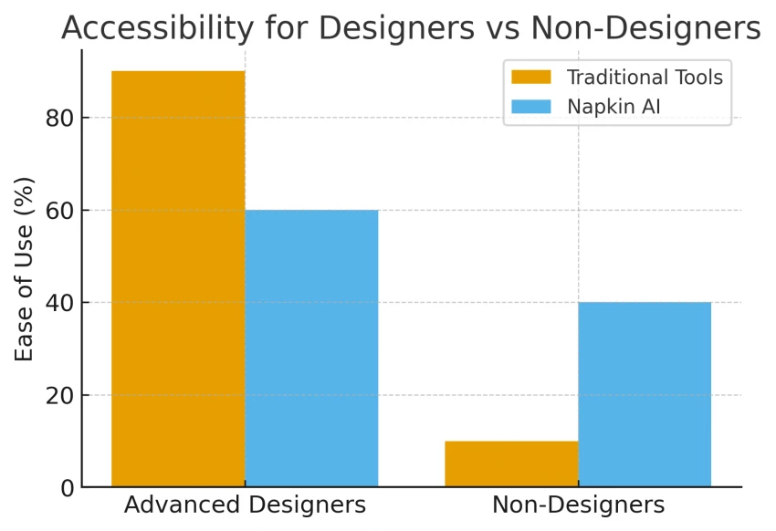
Not everyone knows color theory or layout design, and hiring a graphic designer for every presentation isn’t always realistic. Some reviews on Reddit suggest that Napkin AI lowers the entry barrier for people who simply want clear, minimal visuals without advanced software. Suppose a teacher wants to turn lecture notes into a mind map; they can input plain sentences and still achieve a professional diagram. This approach may also cut down costs for smaller organizations, something worth looking at next.
Startups often claim they can’t justify recurring expenses for expensive design software. In this case, Napkin AI’s pricing plans appear more budget-friendly.
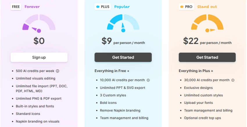
The free plan offers limited credits, while the Pro tier removes watermarks and increases flexibility. While it isn’t entirely free of cost, the tool could save money otherwise spent on outsourced design. Still, affordability matters less if students and educators cannot use it effectively, which brings us to its role in learning.
Academic material is notoriously text-heavy, and students frequently struggle with memorization. Platforms like Fresh van Root highlight that Napkin AI can transform lecture notes into diagrams or flowcharts that aid retention. Suppose a student is preparing for an exam; converting notes into visuals could make revision more efficient. This educational potential overlaps with another pressing need—marketing, where quick visuals are equally critical.
In fast-paced marketing, design bottlenecks can slow campaigns. Napkin AI is said to produce export-ready images in seconds, which could then be posted directly on LinkedIn or Instagram. Comparisons made by Presentations.AI suggest that Napkin is better for single visuals, while slide-building tools still dominate full presentations. Suppose a brand needs an infographic within minutes; this feature saves them from delays. However, marketing teams often operate remotely, which raises another problem—collaboration.
Remote teams need tools that allow real-time input and editing. According to TechPoint Africa’s review, Napkin AI includes collaboration features where multiple people can refine the same diagram. This means teams working across time zones don’t have to email back-and-forth PDFs. Suppose a consultant is sharing a client strategy map; co-editing reduces miscommunication. But beyond teamwork, visuals also help in client presentations, where clarity matters most.
Agencies often complain that clients ignore long proposals. By generating a process flow or customer journey map through Napkin AI, consultants can show the “big picture” visually. The Rundown AI listing suggests that the tool is already popular with agencies who prioritize clarity. Suppose an HR consultant needs to explain onboarding policies—showing a flowchart may be more persuasive than a document. Still, many users note frustrations with the free plan, which needs to be addressed next.
The free plan, while accessible, often frustrates users due to watermarks and weekly credit limits. App Store feedback shows that some users downgrade their ratings because of this. Suppose a user hits their credit limit mid-project; it disrupts the workflow. While upgrading may solve the issue, repetitive layouts and template fatigue are another common complaint, something worth unpacking further.
Repeatedly generated diagrams sometimes look too similar, especially for power users. According to NextBestAI’s review, users can overcome this by refining text prompts and editing icons, fonts, or color schemes inside the tool. Suppose a marketing team runs campaigns weekly; they can avoid repetition by customizing every export. Still, some will argue whether Napkin AI can truly replace established design tools, which leads naturally into a comparison.
Compared to Canva or Visme, Napkin AI focuses on speed and automation, while traditional tools give complete design control. TechCrunch suggests Napkin shines for idea generation, while full design tools still dominate brand-level campaigns. Suppose a company needs quick brainstorming visuals—Napkin suffices; for polished branding, a hybrid workflow is best. The discussion naturally opens up into how these solutions play out in specific real-world scenarios.
Reviews and case studies imply different sectors benefit in unique ways. Startups use it for investor pitch visuals, HR teams visualize policies, while product managers map user journeys. The Google Play listing shows mixed ratings, with many praising speed but pointing out occasional inaccuracies. Suppose businesses integrate this tool strategically; it can fill a gap without replacing everything. To maximize value, certain usage tips help.
Experts often suggest that structured text inputs (like headings and lists) produce clearer outputs. Users can also export visuals into PDF or PowerPoint for layered presentations. Monitoring credit usage ensures fewer interruptions. Suppose a team tracks updates via Napkin’s official site; they stay ahead of new features. These tips bring us closer to a fair evaluation—who is Napkin AI really for?
Napkin AI isn’t flawless, but it addresses real-world issues like information overload, design barriers, and cost constraints. Businesses, educators, and individuals who want clarity over polish may find it valuable. However, for advanced branding or highly creative work, traditional tools may still be preferable. Suppose the tool continues evolving, it might become a standard addition to productivity toolkits.
Be the first to post comment!

Unlucid AI is one of those tools that looks simple on the surface but becomes mo...
Sakshi Dhingra1 day ago
I’ve tried almost every AI design tool out there.Not casually, I used them for c...
Sakshi Dhingra1 week ago
I didn’t start using AI tools because they were trending.I started because editi...
Sakshi Dhingra1 week ago
At one point, Canva stopped being enough for me. Not because it’s bad, but becau...
Sakshi Dhingra1 week ago
Why People Start Looking Beyond Janitor AIJanitor AI built its popularity on fre...
Sakshi Dhingra1 week ago
The Moment That Made Me Try Both ToolsThere’s a point where creating videos stop...
Sakshi Dhingra1 week ago