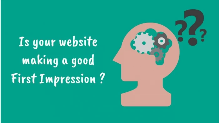
When someone visits your website for the first time, a silent judgment is already taking place—faster than you may realize. Research suggests that it takes only 50 milliseconds (0.05 seconds) for a visitor to form an opinion about a website. That’s less time than it takes to blink. Within that instant, potential customers decide whether to stay, explore, and trust—or click away and never return.
In today’s digital-first world, where websites act as storefronts, salespeople, and brand ambassadors all at once, understanding the science behind first impressions is not just useful, it’s essential. Let’s dive into what psychology, design principles, and real-world data reveal about the way people perceive websites, and what your own site might really be saying about your brand.
First impressions have always mattered in human interactions. From job interviews to social meetings, our brains are wired to quickly assess people and environments. Online, this instinct hasn’t changed—it has intensified.
With over 1.8 billion websites live today, competition for attention is fierce. Users don’t just want information; they want confidence, credibility, and a reason to invest their time. A sloppy or confusing website can silently communicate untrustworthiness, even if the business behind it is solid.
In fact:
Your website isn’t just a digital space—it’s a psychological handshake.
To understand why visitors react so quickly, it helps to know how the brain processes information:
Humans are visual creatures. The brain processes images 60,000 times faster than text. This means layout, colors, and images are noticed long before words.
This refers to how easily information is processed. Websites that are intuitive and simple to navigate feel more “fluent,” and the brain rewards that with positive emotions. Complex or cluttered sites feel taxing, triggering doubt.
A cognitive bias where our impression of one aspect influences our perception of the whole. If your website looks polished and professional, people are more likely to assume your products or services are high quality—even before they read details.
Subtle signals like security badges, testimonials, or professional photography trigger subconscious feelings of safety and reliability. Missing or poorly executed cues lead to skepticism.
Every design choice, from typography to loading speed, sends a message. Here’s what different elements may be silently communicating:
Several studies shed light on how first impressions work in digital environments:
Together, these findings highlight one truth: design choices shape trust more than words ever could in those first few moments.
Knowing the science is one thing; applying it is another. Here are actionable strategies:
Your homepage is the front door. Prioritize clarity:
Ensure your colors, fonts, and imagery align with your brand voice. Inconsistency makes you look careless.
Use tools like Google PageSpeed Insights to test and improve performance. Compress images, use a CDN, and minimize heavy scripts.
Clutter overwhelms. White space (or negative space) helps content breathe and directs focus where you want it.
Over 60% of web traffic is mobile. If your site isn’t responsive, you’re losing trust—and sales.
Include testimonials, recognizable client logos, certifications, or even clear contact details. Transparency reduces doubt.
Visitors notice grammar errors, awkward phrasing, or fluff. Content should be relevant, engaging, and free of mistakes.
Not every website should look the same. Different industries rely on specific design cues to build the right impression:
Understanding your audience’s expectations is crucial—what works for one sector might repel another.
A poorly designed website doesn’t just look unprofessional—it can directly hurt your bottom line.
Think of it like walking into a messy store with flickering lights—you might turn around before even browsing.
As technology evolves, first impressions are no longer just about aesthetics. In the next few years, the following will also play a role:
The principle remains the same: people decide fast, but the tools to influence those decisions are expanding.
Your website is constantly speaking to visitors—even when you aren’t. From the colors and fonts you choose to how fast your homepage loads, every detail is a signal. And in a digital world overflowing with options, you don’t get a second chance at a first impression.
Investing in design, psychology-driven choices, and user experience isn’t vanity—it’s strategy. Because the science is clear: in those first few milliseconds, your website is either opening the door to trust, engagement, and sales…or quietly pushing people away.
Be the first to post comment!
Introduction: Why Sales Automation Is No Longer OptionalToday’s B2B sales enviro...
Michael Hicklen1 month ago

Image search has quietly become one of the most powerful discovery, research, an...
Michael Hicklen1 month ago
Why Workflow Automation Matters in 2026Automation tools help businesses:● S...
Michael Hicklen1 month ago

1) Foundations :What software review platforms are-Software review platforms are...
Michael Hicklen1 month ago

1. What AI Automation in Daily Work Actually Means?1.1 AI automation in daily wo...
Michael Hicklen1 month ago
1. What Is a CRM?Definition-A CRM (Customer Relationship Management) system...
Michael Hicklen1 month ago