
I didn’t start using Placer.ai because I was excited about foot traffic data.
I started using it because I was tired of confident guesses.
Every discussion around store performance, site potential, or market demand seemed to rely on assumptions that sounded logical but were rarely tested. Someone would say, “This area gets good traffic” or “That competitor is stealing our customers”, and the conversation would move on without evidence.
Placer.ai didn’t magically fix that problem, but it did change the way I asked questions. Over time, it became less of a “tool I checked” and more of a reference point I kept coming back to when things didn’t add up.
This is what using it actually felt like.
My first reaction to Placer.ai wasn’t excitement — it was overload.
The dashboard is clean, but the amount of information behind each view is dense. Trade areas, visit frequency, dwell time, cross-shopping, demographics — it all appears quickly, and at first it’s tempting to treat it as definitive truth.
That was my first mistake.
Early on, I caught myself assuming that because the data looked precise, it was precise. Over time, I learned that Placer.ai works best when you treat it as directional intelligence, not a courtroom exhibit.
Once I adjusted my mindset, the platform started making more sense.
The biggest shift in my thinking came from trade area analysis.
Before using Placer.ai, I thought I had a decent understanding of where visitors came from. Distance felt intuitive. Closer locations should draw more traffic.
Placer.ai quietly dismantled that assumption.
I saw locations pulling disproportionately from areas I wouldn’t have expected, while nearby neighborhoods barely showed up. In some cases, natural barriers, commuting routes, or competing destinations mattered far more than proximity.
What surprised me most wasn’t the shape of the trade areas — it was how consistent they were over time. This wasn’t random noise. Patterns repeated week after week.
That’s when I stopped relying on radius-based logic entirely.
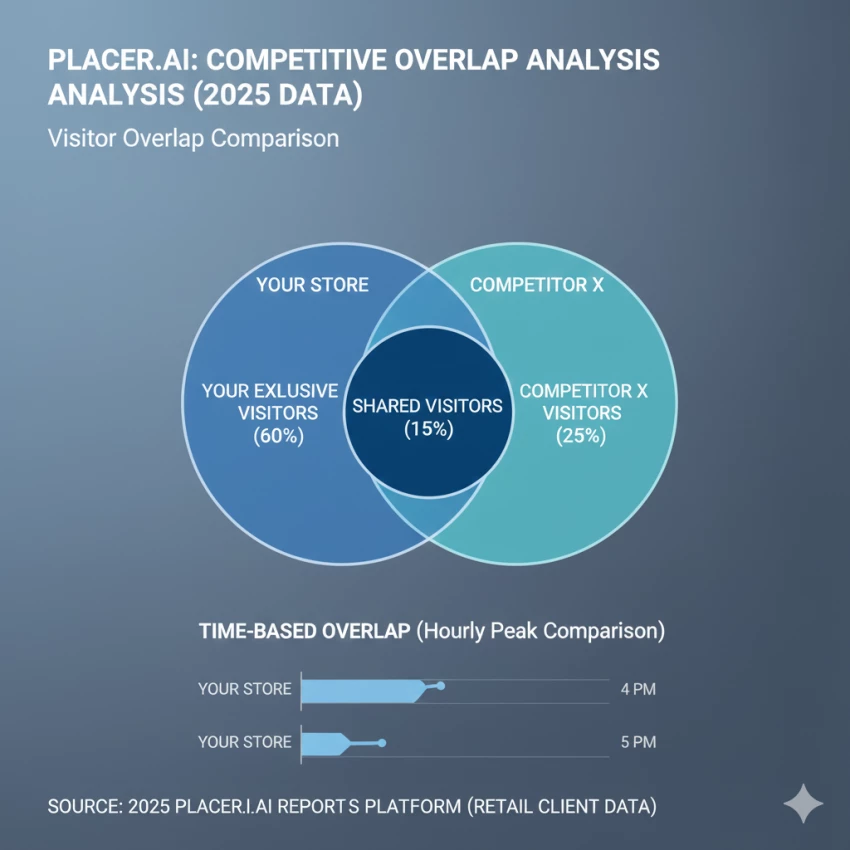
One of the most tempting features is competitive benchmarking. It’s satisfying to see overlap percentages and think you’ve uncovered a clear threat or opportunity.
In reality, this is where Placer.ai requires the most restraint.
I learned quickly that overlap doesn’t automatically mean substitution. Two locations can share visitors for completely different reasons — convenience, timing, or unrelated errands.
The platform shows shared movement, not shared intent.
Understanding that difference takes time.
Used carefully, competitive data helped me ask better questions. Used carelessly, it could have pushed me toward the wrong conclusions.
Cannibalization modeling was one of the few areas where Placer.ai consistently delivered practical value.
Instead of guessing whether a new location would hurt existing ones, I could observe what happened when similar changes occurred elsewhere. Traffic shifts, not just totals, told a more honest story.
In several cases, I saw that overall brand traffic increased even when individual locations dipped slightly. Without that context, those dips would have looked like failures.
This feature alone justified a lot of the platform’s learning curve.
I used the demographic and lifestyle data cautiously.
It’s useful for framing conversations — understanding whether a location skews toward families, professionals, or budget-conscious visitors. But I never treated it as a literal description of individuals.
Over time, I found it most valuable when comparing locations relative to each other, not when analyzing a single site in isolation.
It answers “how is this different?” better than “who exactly is this?”
In high-traffic urban and suburban areas, Placer.ai felt reliable. Trends aligned with real-world changes, seasonal patterns made sense, and anomalies were usually explainable.
In lower-density or niche locations, confidence dropped.
Sometimes the data felt thin. Sometimes historical views smoothed over details I wanted to see. This didn’t make the platform useless — it just meant I learned where to trust it and where to double-check.
One thing I appreciated was consistency. Even when absolute numbers felt uncertain, relative change was usually dependable.
I won’t pretend pricing didn’t influence how I evaluated Placer.ai.
It’s not a casual subscription. You don’t “try it for a month” and see how you feel. Using it properly requires commitment — financially and mentally.
That cost pressure actually forced discipline. I stopped opening the platform out of curiosity and started opening it with specific questions in mind.
In that sense, the price became a filter.
If I couldn’t articulate why I needed the data, I probably didn’t.
The biggest impact wasn’t a single insight. It was a shift in thinking.
I stopped asking:
“Does this location feel busy?”
“Is this a good area?”
“Are we losing customers?”
And started asking:
“Where are visitors actually coming from?”
“What patterns repeat over time?”
“What changed before performance shifted?”
Placer.ai didn’t give me answers.
It gave me better questions.
Despite its strengths, there were moments of frustration.
I wanted:
The platform assumes a certain level of analytical maturity. If your organization isn’t ready for that, the value can get lost.
Yes — but with conditions.
I wouldn’t use Placer.ai for:
I would use it when:
Placer.ai didn’t make decisions easier.
It made them more honest.
Using Placer.ai over time didn’t feel like adopting a tool. It felt like learning a new lens for interpreting the physical world.
Sometimes that lens confirmed what I suspected.
Sometimes it quietly contradicted me.
The value wasn’t in being right more often.
It was in being wrong earlier, before mistakes became permanent.
That alone changed how I think about location data.
Be the first to post comment!

I’ll admit it, SpicyChat AI is one of those tools you don’t exactly open with “s...
Vivek Gupta4 days ago

For months, the global AI industry has lived in a state of suspended animation w...
Vivek Gupta1 week ago

In today’s fast-moving digital landscape, intelligent software that can act inde...
Mighva Verma3 weeks ago

In today’s business world, customer expectations have shifted dramatically. Peop...
Mighva Verma3 weeks ago

Top AI Transcription Tools Designed for TeamsRemote and hybrid teams are drownin...
Mighva Verma1 month ago
In today’s content-saturated world, merely producing more isn’t enough. Smart cr...
Mighva Verma1 month ago