Logging into most apps takes thirty seconds. Astra AI took me closer to five minutes, and not because anything broke. The sign in itself is quick. It is everything after the sign in that turns into a small personality quiz. So I decided to document the entire thing, every screen, from the homepage to the dashboard, and tell you exactly what I liked, what annoyed me, and where I raised an eyebrow.
Quick context before we start. Astra AI is an AI tutoring platform for students. It covers maths, physics, chemistry, languages and a bunch of other subjects, and it runs on the web at astra-ai.co plus mobile apps on iOS and Android. The login lives at app.astra-ai.co. That is the door we are walking through today.
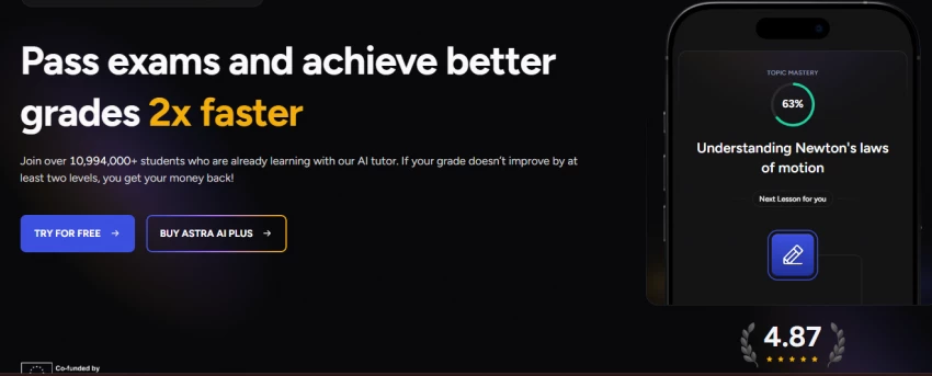
The Astra AI homepage with its 2x faster promise and a 4.87 rating badge
The landing page hits you with a big claim right away: pass exams and achieve better grades 2x faster. There is a counter saying over 10,994,000 students are already learning here, and a money-back promise if your grade does not improve by at least two levels. That last bit is bold. Most edtech companies would never put a refund condition in the hero section.
I noticed two buttons: Try for Free and Buy Astra AI Plus. The free button is what you want if you are just here to log in and poke around. On the right there is a phone mockup showing a Topic Mastery ring at 63 percent for Newton's laws of motion, and a 4.87 rating with little laurel leaves underneath.
My take: Clean, confident, slightly loud. The 2x faster number feels like marketing maths, but the money-back guarantee earns some trust back. I would rate this page a 7.5 out of 10. It does its job, which is getting you to click Try for Free.
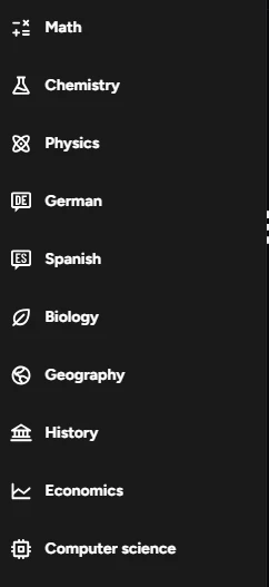
The subject menu covers ten areas from Math to Computer Science
Before signing in, I scrolled through the subjects menu. Math, Chemistry, Physics, German, Spanish, Biology, Geography, History, Economics and Computer Science. Ten subjects visible here, and the site mentions Philosophy, Psychology and French too.
This spread matters. A lot of AI tutors are basically maths solvers with a fresh coat of paint. Seeing humanities subjects like History and Geography in the list tells me they are at least attempting broader coverage. Whether the History tutoring is as good as the Math tutoring is a separate question, and honestly one I am a bit skeptical about.
Liked: The range. Languages plus sciences plus humanities in one place is genuinely convenient for a school student.
Not sure about: Depth. Ten subjects done shallow is worse than four done properly. I will reserve judgement.
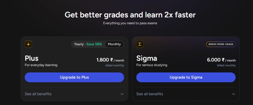
Two plans for Indian users: Plus at Rs 1,800 per month and Sigma at Rs 6,000 per month
Here is where my eyebrows went up. For Indian users, the Plus plan costs Rs 1,800 per month billed monthly, and the Sigma plan, which is meant for serious studying and promises 8000x more usage, costs Rs 6,000 per month. Yearly billing knocks 58 percent off the Plus plan, which brings it to a far more reasonable number.
Let me be blunt. Rs 6,000 a month is more than what many families in India pay for an actual human tuition teacher. Rs 1,800 monthly is also steep for a student audience, though the yearly discount changes the picture quite a bit. The good news is that none of this blocks your login. You can sign in and use the free tier without paying anything.
Rating: 5 out of 10 for Indian pricing. The yearly discount saves it from a lower score. If you are reading this from India, do not pay monthly. Either stay free or commit to yearly.
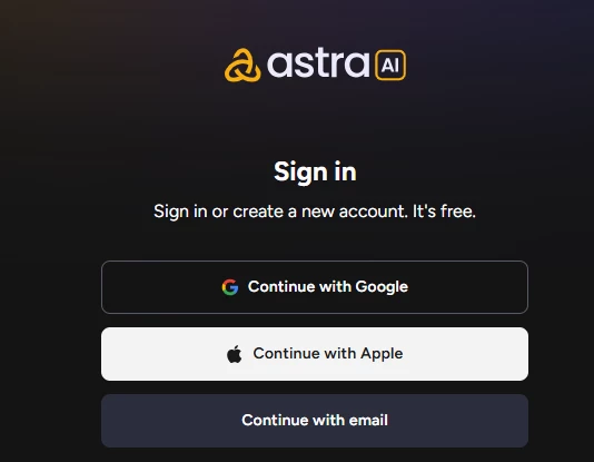
Three ways in: Google, Apple, or email
Click Try for Free and you land here. The sign in screen is refreshingly minimal. Three options: Continue with Google, Continue with Apple, or Continue with email. The same screen handles both sign in and account creation, so there is no separate register page to hunt for. The text under the heading literally says sign in or create a new account, it is free.
I went with Google because I always go with Google. One click, pick the account, done. No password to invent, no OTP dance, no email verification loop. If you choose the email route, you will type your email and set things up manually, which takes a minute longer but works fine if you do not want Google or Apple tracking yet another app.
Loved: This is how login should work. Three buttons, zero clutter, no phone number demanded. 9 out of 10, and I only held back the last point because there is no option to just browse as a guest.
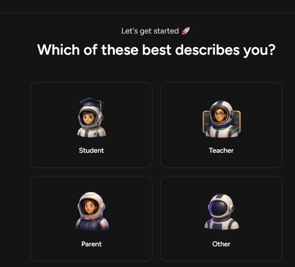
Student, Teacher, Parent or Other, each with its own astronaut avatar
The moment you are authenticated, the onboarding quiz starts. First question: which of these best describes you? The options are Student, Teacher, Parent and Other, each illustrated with a little astronaut character. The graduation-cap astronaut for Student is a nice touch.
This question makes sense. A parent monitoring a kid and a student cramming for boards need very different experiences. I picked Student, since that is the flow most of you will follow, and honestly the astronaut theme kept me mildly entertained through what is about to become a long questionnaire.
My take: Harmless and useful. The visual design is playful without being childish. No complaints here.
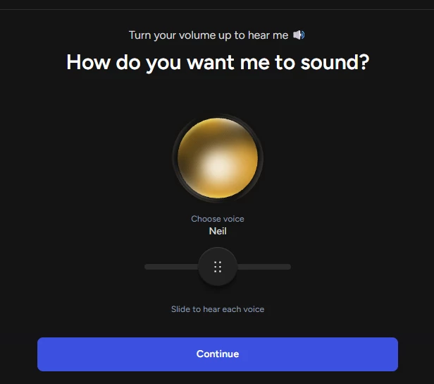
The voice picker, currently set to a voice called Neil
This one surprised me. Astra AI asks how do you want me to sound, and gives you a golden orb with a slider underneath to audition different voices. Mine defaulted to a voice named Neil. You slide across, hear each voice speak, and pick whichever one you can tolerate explaining calculus to you at 11 pm.
The fact that voice selection appears this early tells you Astra leans heavily on spoken explanations, not just text answers. That is a real differentiator from apps that only type at you. The orb visual is a bit dramatic for what is essentially a dropdown, but I get it, they want the moment to feel special.
Liked: Voice-first thinking. Hearing a concept explained aloud genuinely helps some learners.
Minor gripe: I could not tell how many voices existed or whether any sounded Indian. An accent closer to home would help students here.
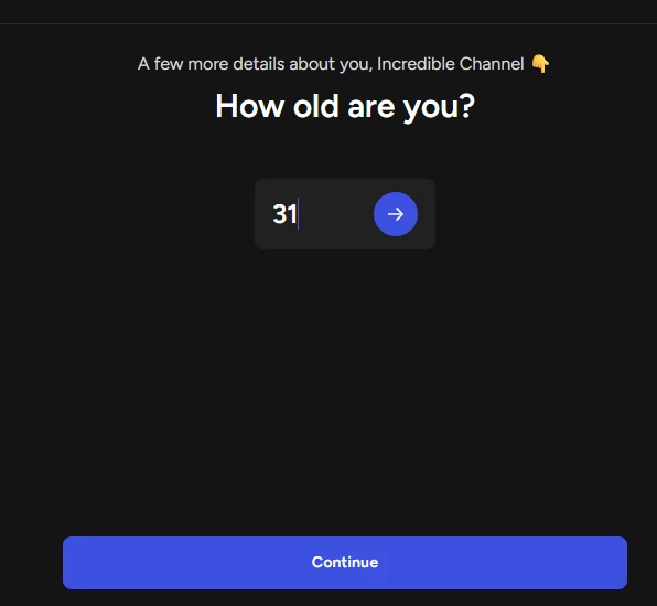
The age screen, where I typed 31 and felt old
Next, Astra asks how old you are. Notice it also greeted me by my Google account name, Incredible Channel, which is what happens when you sign in with a YouTube-linked Google account. Slightly funny, slightly awkward. I typed 31, pressed the arrow, and moved on.
Age gates in study apps are standard, partly for legal reasons around minors and partly to calibrate content difficulty. Nothing controversial here. Just type your age honestly, because it likely affects what curriculum content you see later.
My take: Necessary and quick. Though seeing my channel name in an education app onboarding was not on my bingo card for today.
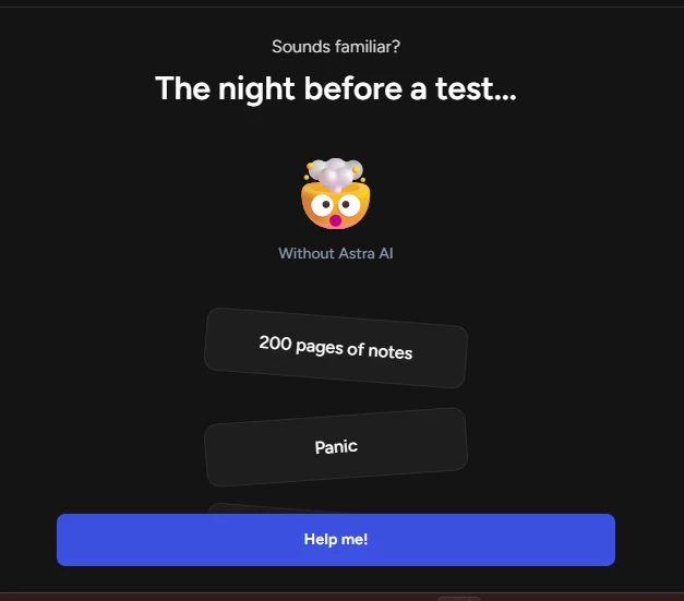
Life without Astra AI: 200 pages of notes and panic, complete with an exploding-head emoji
Now the onboarding shifts from questions to storytelling. The screen says the night before a test, shows an exploding-head emoji labelled Without Astra AI, and stacks up tilted cards reading 200 pages of notes and Panic. The only button available says Help me!
I have to hand it to their marketing team. This is textbook problem agitation, the kind of thing you see in fitness app onboarding. Is it manipulative? A little. Is it accurate? Also yes. Every student has lived this exact night. The crooked card layout selling chaos is a clever design detail.
Rating: 7 out of 10 for effectiveness, 4 out of 10 for subtlety. I clicked Help me! while fully aware of what they were doing to me.
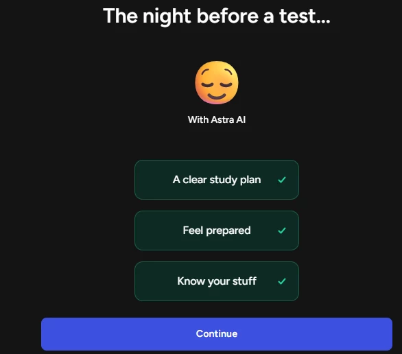
With Astra AI, the emoji is calm and the cards have green ticks
The follow-up screen flips the story. Same night before a test, but now the emoji is serene and the cards are neatly aligned with green checkmarks: a clear study plan, feel prepared, know your stuff. The before and after contrast is the whole pitch in two screens.
The design language here is doing a lot of quiet work. Chaos was tilted and grey, calm is straight and green. Someone thought about this carefully. My only issue is that at this point I have answered two real questions and watched a two-slide advertisement, and I still have not seen the actual product.
Liked: The visual storytelling is genuinely well executed.
Disliked: It pads out an already long onboarding. I came here to study, not to watch a pitch deck.
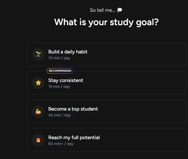
Four commitment levels from 10 minutes a day to 60 plus
Back to real questions. Astra asks for your study goal with four tiers: build a daily habit at 10 minutes a day, stay consistent at 15 minutes with a Recommended badge, become a top student at 45 minutes, and reach my full potential at 60 plus minutes. Straight out of the Duolingo playbook, right down to the recommended tag nudging you toward the modest middle option.
I appreciate that the recommended choice is 15 minutes and not the maximum. A lot of apps guilt you into overcommitting on day one and then watch you quit by day four. Recommending a small sustainable number is honest design. Naturally, I ignored the advice and picked the 60 plus option, because I wanted to see what the app says to overachievers.
My take: Solid screen. The habit-first framing is the right psychology for students. 8 out of 10.
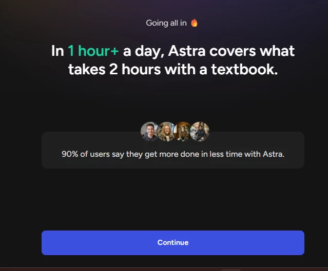
Astra claims one hour with it covers what takes two hours with a textbook
Because I chose the highest goal, I got a congratulatory screen saying going all in, with the claim that in 1 hour plus a day, Astra covers what takes 2 hours with a textbook. Below it, four smiling profile photos and a stat that 90 percent of users say they get more done in less time.
Here is my problem with this screen. That 90 percent figure has no source, no sample size, no link. The 2x claim from the homepage reappears in a new outfit. As someone who spends a lot of time evaluating whether reviews and stats are genuine, unsourced percentages in onboarding flows are a pet peeve. It might be true. I just have no way to check.
Disliked: Unverifiable statistics presented as fact. If the number is real, cite the survey. 4 out of 10 for this screen.
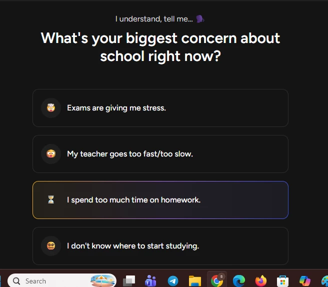
Choosing between exam stress, teacher pace, homework time, and not knowing where to start
The next question asks about your biggest concern about school right now. Options: exams are giving me stress, my teacher goes too fast or too slow, I spend too much time on homework, and I do not know where to start studying. Each has a fitting emoji. I picked the homework one, which is why it is highlighted with that orange-blue gradient border.
These four options actually map to Astra's feature set quite neatly. Exam stress points to Exam Prep mode, homework time points to Solver mode, not knowing where to start points to study plans. They are not just collecting your feelings, they are routing you toward the feature they will show you first. Sneaky, but smart product design.
Liked: The options cover the real pain points. Every student I know fits at least one of these boxes.
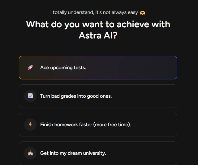
Ace tests, fix grades, finish homework faster, or chase a dream university
One more preference question. Astra asks what you want to achieve, with four options: ace upcoming tests, turn bad grades into good ones, finish homework faster with more free time in brackets, and get into my dream university. I selected acing upcoming tests, and again the selected card gets the gradient outline.
At this point, question fatigue was setting in. This is roughly the eighth screen since sign in, and some of these questions feel like they overlap. Biggest concern and goal to achieve are close cousins. I suspect the answers feed a personalization engine, but I also suspect half of this exists to make you feel invested before the paywall appears.
My take: Fine question, wrong position. Merge it with the previous screen and nobody would miss anything.
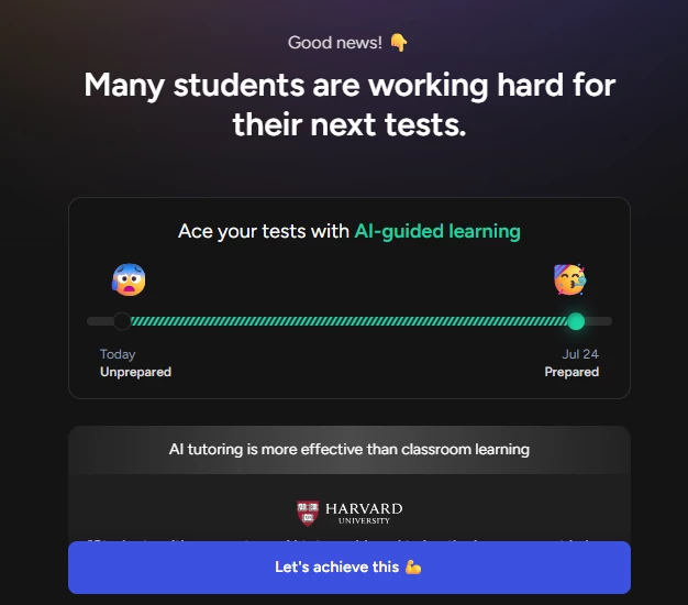
A progress slider from Unprepared today to Prepared by Jul 24, with a Harvard citation below
This screen shows a slider moving from Unprepared today to Prepared by July 24, exactly one week out, with a scared emoji on one end and a celebrating one on the other. Below it sits a claim that AI tutoring is more effective than classroom learning, stamped with the Harvard University logo.
There is a real Harvard study from 2024 where students in a physics course learned about twice as much with an AI tutor as in an active learning classroom, so the citation is not invented from thin air. But that study was one course, one context, with a carefully engineered tutor. Stretching it into a blanket statement that AI tutoring beats classroom learning is doing a lot of heavy lifting. The one-week transformation date is also pure motivational theatre.
Rating: 6 out of 10. Points for citing an actual institution, points deducted for overgeneralizing what the research says.
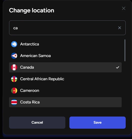
The location picker, where I switched to Canada to test curriculum matching
Astra then adapts content to your country, and you can change it manually. I opened the location picker and switched to Canada, partly as an experiment, since I have researched Canadian curriculum codes for tutoring work before and wanted to see whether Astra actually aligns content to a specific country's syllabus. The search filters countries as you type, with flags next to each name.
Curriculum alignment is quietly one of the most important features in any tutoring app. A physics question is universal, but board exam patterns are not. An app that knows the difference between CBSE, IB and Ontario's course structure is far more useful than a generic solver. The fact that Astra asks for location this deliberately suggests they map content by country, which is a genuinely good sign.
Liked: Country-level curriculum customization, if it works as implied, is a big deal. The picker itself is smooth and searchable.
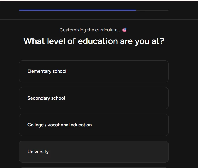
Elementary, secondary, college or university, with a progress bar finally visible on top
Now we are customizing the curriculum, as the header says. The choices are elementary school, secondary school, college or vocational education, and university. Notice the progress bar at the top of the screen, which appears to be past the halfway mark. I wish that bar had been visible from screen one, because for a while I genuinely did not know how deep this questionnaire went.
I picked University. This choice clearly gates what content difficulty you get, so answer it truthfully. A university student getting secondary school explanations would be irritating, and the reverse would be demoralizing.
My take: Essential question, well placed. The late-arriving progress bar is my only grumble.
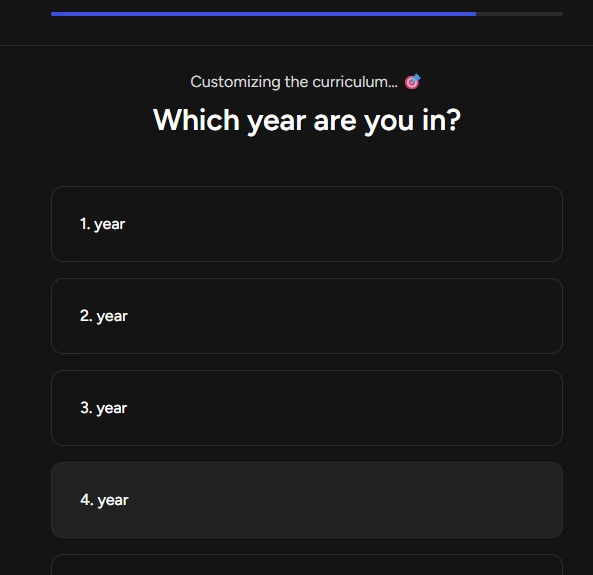
Year selection, going at least four years deep
A follow-up asks which year you are in, listing 1st year through 4th year and beyond. I chose 4th year. Combined with the university selection and the country, Astra now has enough to pin down roughly what level of content I should see. The formatting of the options as 1. year, 2. year and so on reads slightly odd in English, and smells like a translated string from the app's European origins.
Small observation: The numbering style is a cosmetic slip, not a functional one. But polish matters when you are charging premium prices.
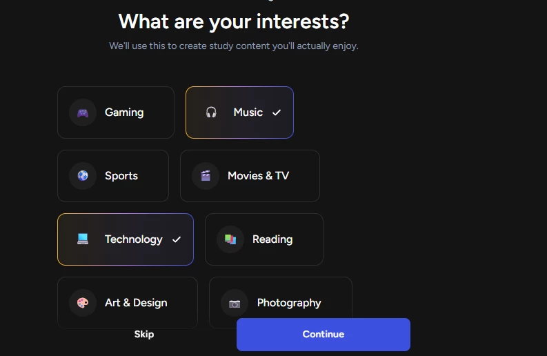
I picked Music and Technology from a grid of eight interests
This is the screen I found most interesting. Astra asks about your interests, with a note saying it will use them to create study content you will actually enjoy. The grid includes gaming, music, sports, movies and TV, technology, reading, art and design, and photography. I ticked Music and Technology. There is also a Skip link if you find this creepy.
The promise here is that examples and word problems get flavoured with things you like. Learn percentages through music streaming numbers, or physics through gaming references. If Astra actually delivers on that, it is a clever engagement trick. If the interests just sit unused in a database, it is another screen between you and the dashboard. I will need more usage time to know which one it is.
Liked: The concept, and the fact that skipping is allowed. 7.5 out of 10 on trust that the personalization is real.
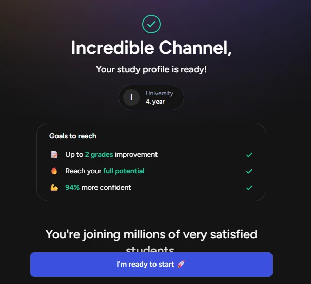
The summary screen with my profile and three promised goals, all pre-ticked
The finish line. A green tick, my name again, and the announcement that your study profile is ready, showing University, 4th year. Below sits a goals card promising up to 2 grades improvement, reaching your full potential, and being 94 percent more confident, each with a checkmark already applied. Then a line about joining millions of very satisfied students, and the big button: I'm ready to start.
That 94 percent more confident stat made me laugh out loud. Confident measured how, exactly? Ticking goals as achieved before I have answered a single question is peak onboarding optimism. Still, the summary itself is useful. Seeing my selections reflected back confirms nothing got lost along the way.
Liked: The profile recap. It closes the loop on all those questions.
Disliked: Pre-checked achievements and another orphaned percentage. Let the product earn the ticks.
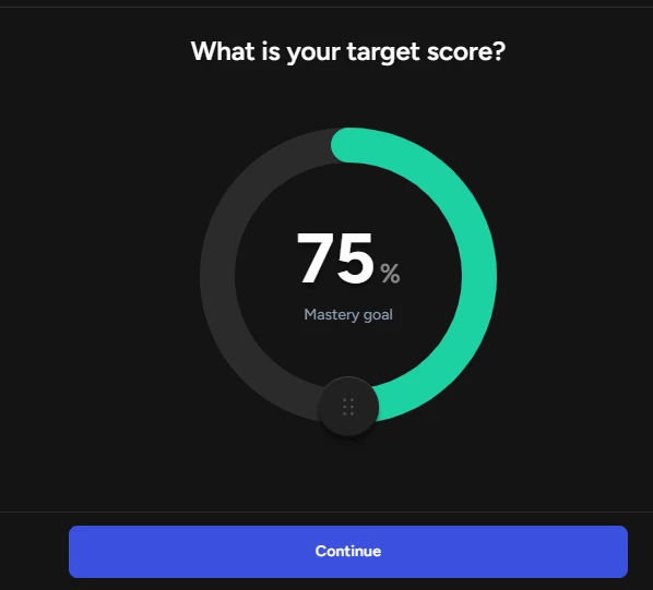
The exam prep dashboard with a Create new exam button front and centre
And here we are. After the whole journey, the dashboard opens on the Exam Prep section with a search bar on top and a big Create new exam button in the middle, flanked by a graduation cap, a dartboard target and a flame icon. A How it works link sits underneath for the lost.
The dashboard is calm compared to the onboarding, which I mean as a compliment. One clear action, no clutter, no popups begging me to upgrade within the first ten seconds. Clicking Create new exam is where the actual studying begins, where you tell Astra what exam you are preparing for and it builds a plan, but that is a story for a separate review.
Rating: 8 out of 10. Focused, obvious, and it respects that you finally want to do something.
Let me pull it all together. The login itself is a 9 out of 10 experience. Three buttons, social sign in, no phone number, no verification maze. If the article ended at step 4, Astra would score near-perfect marks.
The onboarding after the login is where my rating drops. It is long, somewhere around fifteen screens, and a noticeable chunk of it is persuasion rather than configuration. The unsourced statistics bothered me the most, the 90 percent, the 94 percent, the stretched Harvard claim. When a product is genuinely good, and Astra might well be, this kind of number-flinging undermines trust instead of building it.
Here is my honest scorecard for the whole flow:
Overall, I would give the complete login-to-dashboard experience a 7 out of 10. If you are a student, do not let the pricing page or the long questionnaire scare you off. The free sign in takes one click, the questions take four minutes if you do not overthink them, and you can always change your answers later in settings. Just keep your skepticism switched on when the percentages start flying, and you will get through it just fine.
Share your thoughts about this article.
Be the first to post a comment!

Reasons People Look Beyond ThotChat AIThotChat AI built its audience as an adult...
Harpreet Singh11 hours ago
Blackbox AI and Cursor are two of the most talked about AI coding assistants of...
Deepak Mehra1 day ago
Why students go looking for something elseNobody searches for alternatives to a...
Harpreet Singh1 day ago
The Real Problem Behind AI Visual CreationHere is a frustration almost everyone...
Sakshi Dhingra2 days ago
Students using Unstuck AI typically rely on it for lecture transcription, automa...
Harpreet Singh2 days ago
Traditional animation is brutal on time, skill and budget. A single minute of po...
Sakshi Dhingra3 days ago