The Real Problem Behind AI Visual Creation
Here is a frustration almost everyone shares. You have the idea. You have the research, the notes, the data, maybe even a full blog post. The hard part was never the thinking. The hard part is making other people see what you see.
Maybe you have lived one of these moments:
This is exactly the gap Napkin AI was built to close. Instead of asking you to design anything, it reads your text and generates editable diagrams, flowcharts, and infographics from it. Paste your words, click, and pick a visual. It belongs to a new category of software often called AI visual thinking platforms, tools that transform information rather than just decorate it.
But Napkin AI is not the only tool doing this, and depending on your work, it may not even be the best one for you. This guide walks through the strongest alternatives, compares them honestly on features and pricing, and helps you match a tool to your actual situation.
Quick answer Napkin AI alternatives are tools that help transform written ideas, documents, and data into diagrams, infographics, presentations, and visual explanations. While Napkin AI focuses on turning text into editable visuals, alternatives like Canva AI, Gamma, Miro AI, Whimsical AI, Lucidchart AI, Visme, and Microsoft Designer serve different visual communication needs. Canva AI is the best all-round replacement, Gamma wins for presentations, Visme wins for infographics, and Lucidchart wins for professional business diagrams. |
For decades, turning information into visuals followed one path. You wrote the content, handed it to a designer (or fought with PowerPoint yourself), waited for a draft, requested changes, and eventually got a final graphic. The old workflow looked like this: Text, then Designer, then Graphic, then Final Output. Slow, expensive, and full of back-and-forth.
AI visual tools flipped that sequence. Now the flow is: Idea, then AI Understanding, then Visual Draft, then Human Editing, then Final Design. The AI does the heavy lifting of layout and structure, and you spend your time refining instead of building from a blank canvas.
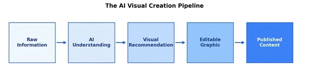
AI visual storytelling tools reduce the gap between information and presentation. Suggested image alt text: AI converting text into a visual infographic.
The numbers behind this shift are hard to ignore. Gamma, an AI presentation tool that launched publicly in 2023, now reports over 70 million users. Lucidchart claims around 70 million users of its diagramming platform. Visme says more than 27 million people use it to build visual content, and its case studies report teams cutting content creation time by 60 percent or more. When a category grows this fast, it usually means it solved a problem people were quietly suffering with for years.
Before comparing alternatives, it helps to understand exactly what Napkin AI does well, because that becomes your benchmark.
Napkin AI works in a refreshingly simple way. You paste or write text, select a passage, and the tool generates several visual interpretations of it: flowcharts, mind maps, process diagrams, comparisons, timelines, and framework-style graphics. Every element stays editable, so you can change icons, colors, fonts, and connectors after generation. Finished visuals export as PNG, SVG, PDF, or PowerPoint, and the tool works with text in over 60 languages.
The practical result is that non-designers can produce professional-looking explanatory graphics in seconds. Users consistently describe generating a usable diagram from a 300-word passage in under a minute, work that would take 30 to 60 minutes in a traditional design tool.
This is the part people often get confused about. Napkin AI is not an AI image generator like Midjourney or DALL-E. Those tools create decorative pictures. Napkin AI creates explanatory visuals, graphics whose entire job is to make information easier to understand. The difference matters a lot when choosing a tool:
| Tool Type | Typical Output | Best Suited For |
| AI Image Generator | Decorative images and artwork | Illustrations, marketing art, creative visuals |
| AI Presentation Tool | Complete slide decks | Pitches, reports, lectures |
| Napkin AI Style Tool | Explanatory diagrams and infographics | Making ideas and processes understandable |
Based on hands-on reviews published through 2026 and aggregated user feedback, here is how Napkin AI scores across the areas that matter for visual communication:
| Category | Score |
| Text understanding | 9/10 |
| Visual explanation | 9/10 |
| Editing flexibility | 8/10 |
| Presentation creation | 7/10 |
| Data visualization | 7/10 |
| Brand customization | 7/10 |
Now for the main event. Each of these seven tools overlaps with Napkin AI somewhere, but each has a distinctly different center of gravity. Pay attention to the ideal user line under each one, because that is usually the fastest way to know if a tool fits you.
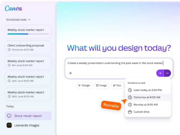
If Napkin AI is a specialist, Canva AI is the everything store. Canva's AI features live under the Magic Studio umbrella and cover far more than text visualization: Magic Design turns prompts into full layouts, Dream Lab generates images, and the 2026 Canva AI 2.0 update added a conversational interface that can build a full editable pitch deck from a single request. Add over 1.6 million free templates, and you get a platform that handles infographics, presentations, social posts, videos, and brand kits in one place.
The trade-off is focus. Canva gives you a starting layout and a giant toolbox, but it does not read a passage of text and propose five different diagram interpretations the way Napkin does. You do more of the arranging yourself.
| Feature | Canva AI |
| Infographics | Yes, with thousands of templates |
| Presentations | Yes, including AI-generated decks |
| Templates | Extensive, 1.6M+ on free plan |
| Collaboration | Yes, real-time |
| AI writing | Yes, via Magic Write |
| Plan | Price |
| Free | $0, includes monthly AI credits |
| Pro | About $12/month billed annually ($18 monthly) |
| Business | About $25/user/month |
Strength: the broadest feature set in this list and a genuinely useful free plan. Limitation: AI credits are metered on every plan, and heavy AI use burns through them quickly.
Ideal user: marketers, social media creators, and small businesses that need many types of visuals, not just diagrams.
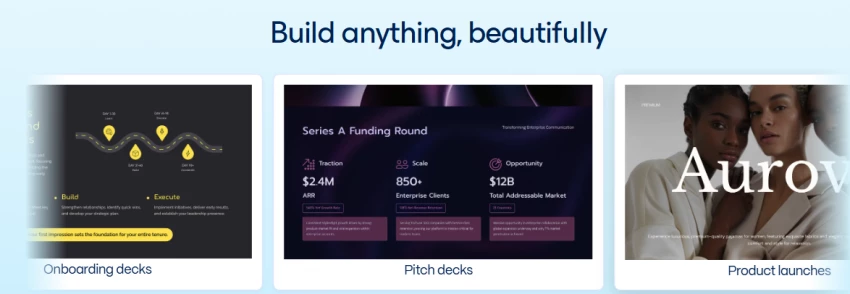
Gamma answers a different question than Napkin. Instead of turning a paragraph into a diagram, it turns a rough idea into a complete presentation, document, or even a web page. Type a topic, and Gamma builds an outline, generates slides with text and images, and applies a coherent theme, usually in under a minute. It uses a flexible card-based format rather than rigid slides, and finished decks export to PowerPoint or PDF or publish directly to the web.
With over 70 million users, Gamma has become the default AI presentation tool for a lot of people. Its credit system is worth understanding before you commit: the free plan gives 400 one-time credits (roughly 8 to 10 full presentations) that never refresh, while a typical AI-generated deck costs around 40 to 50 credits.
| Feature | Napkin AI | Gamma |
| Infographics | Strong | Medium |
| Presentations | Medium | Strong |
| Text conversion | Strong | Strong |
| Templates and themes | Medium | Strong |
Strength: fastest idea-to-finished-deck workflow in the category, with Plus at just $8/month on annual billing. Limitation: free credits are one-time only, and PowerPoint exports sometimes need manual cleanup.
Ideal user: anyone who presents regularly and wants slides done in minutes instead of evenings.
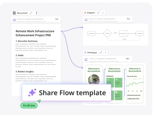
Miro is an infinite whiteboard that whole teams work on at once, and its AI layer sits on top of that. Miro AI can generate mind maps and flowcharts from prompts, summarize sticky-note brainstorms, cluster ideas automatically, and catch team members up on what changed. It ships with more than 2,000 templates for retrospectives, story mapping, customer journeys, and OKR planning, plus 130+ integrations across the Microsoft and Atlassian ecosystems.
A concrete example: a product team planning a new feature roadmap can dump raw ideas onto a board in a live workshop, ask Miro AI to cluster and summarize them, generate a mind map of the winning direction, and convert it into a rough roadmap, all in one session without leaving the board.
Strength: unmatched for group thinking and workshops, with a free plan that allows unlimited use inside 3 boards. Limitation: it is a collaboration space first, so polished standalone infographics are not really its job.
Pricing: free plan, then Starter at $8/editor/month annual and Business at $16.
Ideal user: product teams, facilitators, and remote teams that think together.
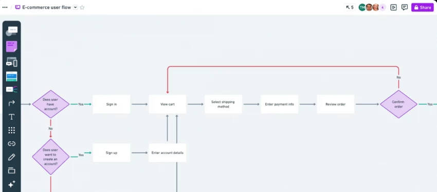
Whimsical is the tool for people who want a clean flowchart right now with zero fuss. Independent testing in 2026 rated it the fastest text-to-diagram tool for simple and moderate flows. It covers flowcharts, wireframes, mind maps, and process diagrams with a deliberately minimal, fast interface.
A quick example of what it does: type "customer onboarding process" and Whimsical AI produces a connected flow like Customer Signup, then Verification, then Activation, then Retention, laid out and styled instantly, ready for you to extend.
Strength: speed and clarity for everyday diagrams. Limitation: the free plan caps you at 100 lifetime AI actions (not monthly), and the AI cannot generate swimlanes or complex conditional logic reliably.
Pricing: limited free plan, then Pro at $10/editor/month annual. Ideal user: product managers and startup teams who diagram weekly.
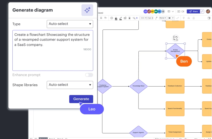
Lucidchart is where diagramming gets serious. It handles enterprise workflows, technical architecture diagrams, network maps, ER models, BPMN process flows, and org charts, with deep shape libraries and intelligent connectors. Its AI can generate diagrams from text prompts and suggest shapes as you build. It also carries the compliance certifications (SOC 2, HIPAA eligibility, FedRAMP) that regulated industries require, and integrates tightly with Slack, Teams, Jira, and Google Drive.
| Strength | Weakness |
| Enterprise ready with serious compliance credentials | Less creative and visually playful than Napkin or Canva |
| The deepest, most powerful diagramming in this list | A real learning curve for casual users |
Pricing: free plan limited to 3 documents and 60 shapes, then Individual around $9/month and Team around $10/user/month. Ideal user: IT teams, engineers, analysts, and anyone whose diagrams end up in audits or formal documentation.

If your end goal is a polished, data-rich infographic or report, Visme is arguably stronger than Napkin AI itself. It supports more than 16 chart types including Mekko, waterfall, and Gantt charts, offers interactive elements like hover effects and animations, and its AI can generate draft presentations and documents from prompts. Visme reports over 27 million users, and its published case studies include a healthcare team cutting content creation time by 60 percent.
Where it lags Napkin is spontaneity. Visme starts from templates and data you bring; it will not read your paragraph and invent five diagram concepts for it. Where it beats Napkin is data storytelling: real charts wired to real numbers, marketing reports, and brand-controlled output at scale.
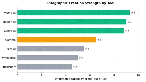
Infographic capability comparison across Napkin AI and its main alternatives, based on aggregated 2026 reviews.
Pricing: free basic plan, Starter at $12.25/user/month annual, Pro at $24.75/user/month annual.
Ideal user: marketers and analysts who publish data-heavy visuals regularly.

If your work already lives in Word, PowerPoint, and Outlook, Microsoft's answer may be the path of least resistance. Microsoft Designer generates social graphics and design layouts from prompts and has a free tier with daily image boosts. Copilot inside Microsoft 365 goes further: it can draft a PowerPoint deck from a Word document, redesign slides, summarize documents, and transform content between formats without you leaving the apps you use daily.
Strength: zero new tools to learn and deep document transformation inside Office. Limitation: Copilot for Microsoft 365 costs $18/user/month as an add-on to an existing subscription, which adds up, and its visuals are functional rather than striking. Ideal user: corporate teams standardized on Microsoft 365.
Here is the full picture in one table. Ratings reflect how each tool performs at each job, not overall quality.
| Tool | Best For | AI Visual Creation | Infographics | Presentations | Collaboration | Free Plan |
| Napkin AI | Idea visualization | Excellent | Excellent | Medium | Medium | Yes |
| Canva AI | All-round design | Excellent | Excellent | Excellent | Excellent | Yes |
| Gamma | Presentations | Good | Medium | Excellent | Good | Yes |
| Miro AI | Brainstorming | Good | Medium | Low | Excellent | Yes |
| Whimsical AI | Diagrams | Excellent | Medium | Low | Good | Limited |
| Lucidchart AI | Business diagrams | Excellent | Low | Medium | Excellent | Limited |
| Visme AI | Infographics | Excellent | Excellent | Good | Good | Yes |
Feature tables are useful, but most people just want to know: which one should I pick for my situation? Here is the short version.
Go with Canva AI, Gamma, or Napkin AI. Assignments, reports, and class presentations are exactly what these three excel at, and all offer free plans generous enough that a student may never need to pay. Gamma alone can turn lecture notes into a presentable deck in minutes.
Canva AI, Visme, and Napkin AI make the strongest trio. Campaign visuals, content repurposing, and data-backed reports cover most of a marketer's visual workload. A common workflow is drafting explanatory diagrams in Napkin, building branded infographics in Visme, and producing everything else in Canva.
Lucidchart AI, Miro AI, and Gamma fit best. Strategy meetings happen on Miro boards, formal workflow documentation lives in Lucidchart, and Gamma handles the decks that carry decisions upward. All three offer the admin controls and collaboration features teams actually need.
Napkin AI and Whimsical AI are the picks. Both are built for one job: taking dense, complex information and making it instantly understandable. Napkin handles the explanatory infographics; Whimsical handles the process flows and concept maps.
To make this concrete, here is a workflow content teams use every week to squeeze more value from a single blog post:
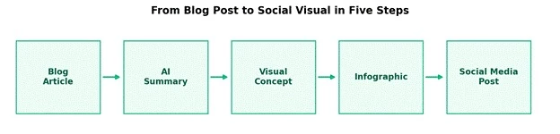
One blog article becomes multiple visual assets through an AI-assisted pipeline.
• Blog article: start with the finished long-form piece, which already contains the structure and key points.
• AI summary: paste the article into your tool of choice and let it extract the 4 to 6 core ideas worth visualizing.
• Visual concept: pick the format that matches the content, such as a process flow for how-to content or a comparison graphic for versus content.
• Infographic: generate it in Napkin AI or Visme, then spend five minutes adjusting colors and fonts to match your brand.
• Social media post: export as PNG, resize in Canva for each platform, and schedule. One article just became a week of visual content.
The whole pipeline takes 20 to 30 minutes once you have done it twice. The same work through a design queue used to take days.
None of these tools is magic, and pretending otherwise leads to disappointment. Here are the honest trade-offs of the whole Napkin AI style category:
| Challenge | Real-World Impact |
| AI interpretation errors | Generated visuals sometimes miss your intent, so every output needs a human review pass |
| Limited creativity control | Layouts can feel formulaic after heavy use; distinctive design still requires human input |
| Branding restrictions | Watermark removal and custom fonts usually sit behind premium plans |
| Complex data visualization | Specialized tools like Tableau or Power BI still perform better on serious datasets |
| Structured input dependency | Vague or messy text produces vague or messy visuals; garbage in, garbage out still applies |
Weighing AI capability, output quality, pricing fairness, free plan generosity, and breadth of use, here is how the field stacks up in 2026:
| Rank | Tool | Overall Score |
| 1 | Canva AI | 9.2/10 |
| 2 | Napkin AI | 8.8/10 |
| 3 | Gamma | 8.7/10 |
| 4 | Miro AI | 8.5/10 |
| 5 | Visme AI | 8.4/10 |
| 6 | Whimsical AI | 8.2/10 |
| 7 | Lucidchart AI | 8.1/10 |
One important caveat: the best option depends less on raw AI capability and more on the type of visual communication you need. Lucidchart sits last here yet is the clear first choice for enterprise diagramming. Rankings are a starting point, not a verdict.
The category is still young, and the direction of travel is visible in what shipped through 2025 and 2026. Expect these five trends to define the next couple of years:
• AI-generated business diagrams will become a default feature inside office suites rather than a standalone product category.
• Automatic data storytelling will mature, with tools reading a spreadsheet and proposing the chart, the headline, and the narrative around it.
• AI presentation agents will handle the full loop, from brief to deck to speaker notes, with conversational refinement replacing manual editing.
• Interactive infographics will replace static ones, with hover states, embedded data, and live updates becoming normal for web publishing.
• Real-time collaboration with AI as a participant, summarizing, clustering, and drafting alongside human teammates, will become standard in tools like Miro.
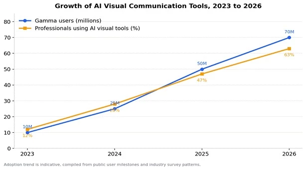
Growth of AI visual communication tools from 2023 to 2026, tracked through Gamma's public user milestones and professional adoption trends
After looking at all these tools, I don't think there's a single "best" AI like Napkin AI for everyone. It really depends on what you're trying to create. If I needed an all-purpose design platform, Canva AI would be my first choice. When presentations are the priority, Gamma saves the most time. For business diagrams, Lucidchart feels more professional, while Visme stands out for creating polished infographics. Napkin AI still has a unique advantage when the goal is turning plain text into clear, editable visuals within seconds.
My advice is to stop searching for the tool with the longest feature list and focus on the one that matches your daily workflow. The best AI is the one you'll actually use consistently, whether that's explaining ideas to clients, creating presentations, designing reports, or simplifying complex information. A tool that fits naturally into your work will always deliver more value than one packed with features you never touch.
Share your thoughts about this article.
Be the first to post a comment!
The same tool can be a 4.7 on one site and a 3.9 on another. Here is what is rea...
Nitin1 month ago
Here is the number worth pinning above your budget: in Gartner Digital Markets r...
Deepak Mehra1 month ago
What Artlist AI is in 2026Artlist began as a royalty-free music library. By 2026...
Deepak Mehra2 months ago

Most AI tool failures do not announce themselves. There is no crash, no angry em...
Nitin2 months ago

The best AI image generator in 2026 is Nano Banana 2 for speed, FLUX.2 for photo...
Parveen Verma2 months ago

“Useful” is a slippery word for a coding assistant. A tool can be brilliant at o...
Sakshi Dhingra2 months ago