
The modern website is no longer a digital brochure. It is becoming the first place where people search, compare, submit information, upload files, request support, book time, make payments, and decide whether a service is worth trusting.
For years, websites were built around presentation. A homepage introduced the company, service pages explained the offer, and a contact page gave users a phone number or form. The real service experience began later, usually through a call, email, or manual follow-up.
Users now expect the website itself to handle the first stage of service. They want to know whether a service fits their situation, what information is required, how quickly they can start, and what will happen after they submit a request.
The user may see a simple page, but behind that page sits a connected system of forms, search tools, CRM records, payment gateways, scheduling tools, document uploads, analytics, and support automation.
DataReportal’s 2026 mid-year update reported 6.12 billion internet users worldwide in April 2026, equal to nearly three-quarters of the global population. When online access becomes the default starting point, the website becomes a primary service channel, not a secondary marketing asset.
A static website assumes the visitor knows what they need. A smarter website assumes the visitor may only know the problem they are trying to solve. That difference changes the entire structure of the experience.
A user searching for accounting software may not know which plan fits their business size. A patient looking for a clinic may not know which appointment type to choose. A customer with a broken product may not know whether they need a refund, repair, warranty claim, or technical support.
A service hub reduces that uncertainty by creating guided journeys. It uses clear categories, intent-based navigation, helpful forms, contextual explanations, and visible next steps. The site does not force the visitor to understand the company’s internal structure before taking action.
A useful service journey usually includes these practical elements:
● The page should quickly confirm that the visitor is in the right place and explain the problem or service in plain terms.
● The journey should help users choose the correct path without relying on internal business labels or technical language.
● The content should give enough process detail, proof, and next-step clarity to reduce hesitation before submission.
● The main action should match the user’s intent, whether that action is booking, requesting, uploading, paying, checking eligibility, or asking for help.
● The confirmation step should explain what happened, what comes next, and when the user can expect a response.
Without these pieces, even a visually modern website can feel unfinished because the visitor still has to do too much work.
A service hub is not defined by having a chatbot, a modern design, or a longer homepage. It is defined by how well the website connects information, tools, data, and workflows.
| Service Function | What the Website Must Do | Technology Behind It |
| Discovery | Help users find the right service or answer | Search, SEO, schema, FAQs, AI-assisted navigation |
| Qualification | Understand what the user needs before contact | Conditional forms, filters, guided questions |
| Action | Let users book, request, upload, pay, or submit | Scheduling, payment gateways, secure uploads |
| Routing | Send the request to the right person or system | CRM, help desk, automation rules, notifications |
| Trust | Reduce doubt before users share information | Security, accessibility, reviews, privacy clarity |
| Learning | Improve the journey based on behavior | Analytics, heatmaps, search logs, conversion tracking |
This is where many redesigns fall short. The interface improves, but the service model underneath stays the same. The page templates are updated, but every form still goes to the same shared inbox. Staff still copy details manually. Users still wait without clear confirmation.
A real service hub requires operational design. The website must be planned around what happens before, during, and after the visitor takes action.
Website performance is often treated as a developer metric, but users experience speed as part of service quality. A slow page creates friction before the visitor has read a single sentence. It also sends a quiet signal that the organization may be slow elsewhere.
Google’s mobile research has shown that 53% of visits are likely to be abandoned if a mobile page takes longer than three seconds to load. That number is often discussed in marketing, but it is also an operations warning. If the first service touchpoint is slow, the user journey is already losing attention.
Speed matters across service categories. It affects appointment booking, support requests, account portals, product comparisons, quote forms, local services, education platforms, SaaS websites, healthcare pages, and public information portals.
Users may not understand image compression, Core Web Vitals, JavaScript weight, server response time, or render-blocking code. They simply know whether the site feels responsive. A fast website creates confidence. A slow one asks users for patience before it has earned trust.
Traditional navigation is based on the organization’s structure. Users often think in problems, not departments. That gap is why modern websites need stronger search, clearer service architecture, and better landing pages.
People now arrive through Google, AI answers, social posts, map listings, review platforms, email campaigns, ads, and direct links. Many visitors never start on the homepage. Every important page must work as an entry point. It should explain where the user is, what the page solves, who it is for, and what action makes sense next.
Internal search also needs to handle user language. A visitor may search “can’t log in,” while the company calls it “account access recovery.” Another may search “change delivery date,” while the website uses “shipment modification.” When the site cannot connect user language to business language, the journey breaks.
AI-assisted search can help by recognizing related terms, surfacing relevant pages, and guiding users toward the right action. But it only works well when the underlying content is accurate, structured, and updated.
The old contact form was a digital mailbox. The modern form should work more like an intake engine. It should collect structured information, check what is missing, route the request, and start the next step.
The first submission often decides the quality of the entire service experience. A vague form creates vague data. Vague data slows response. Slow response weakens trust.
A smarter form adapts to the user’s situation. It can show different fields based on service type, location, urgency, account status, product category, document availability, or support issue. It can also prevent missing files, invalid phone numbers, unclear dates, and incomplete descriptions.
Baymard’s 2026 checkout research placed the average documented online cart abandonment rate at 70.22%. That figure comes from e-commerce, but the lesson applies across service design. Digital friction stops action. Long forms, unclear labels, surprise requirements, broken uploads, and weak error messages can make users leave any journey.
Strong intake design depends on a few practical choices:
● Forms should remove questions that do not affect routing, response quality, or the user’s immediate next step.
● Conditional fields should appear only when the answer changes the service path, required documents, timeline, or team assignment.
● Error messages should explain how to fix the issue instead of only saying that something went wrong.
● Upload fields should state file type, size limit, and document expectations before the user reaches the submission point.
● Confirmation messages should tell users whether the request was received and what they should expect next.
These details decide whether a form feels like help or friction.
Modern service discovery is rarely a simple search for a company name. Users often search from a situation. They may be comparing options, checking eligibility, looking for local information, trying to understand cost, or deciding whether their issue is serious enough to act.
This is why context-rich service pages matter. A useful page should explain not only what the service is, but when it matters, who it helps, what information the user may need, and what the next step usually looks like. The goal is not to push visitors into a quick conversion. The goal is to give them enough clarity to make a confident decision.
The same principle applies across technology, healthcare, finance, education, home services, B2B software, and professional services. Users need enough context to decide whether contacting a provider is the right next move.
Location-specific service pages are becoming more useful because many users search with a place, urgency, or situation already in mind. A visitor is not always looking for a broad explanation. They may need information that reflects where the service is offered, what process applies, and what type of support is relevant to their situation.
For example, someone researching a Hawaii personal injury lawyer is likely looking for more than a basic profile page. They may want local context, process clarity, credibility signals, and a simple way to understand whether the service fits their needs before reaching out.
Website content used to be judged mainly by traffic. In a service hub, traffic alone is not enough. A page that attracts visitors but does not help them understand, decide, or act is not doing its full job.
Good content reduces confusion, shortens support loops, improves inquiry quality, and makes the next step easier. Service pages need practical explanations, eligibility cues, process details, pricing context where possible, document requirements, timelines, examples, FAQs, and clear calls to action.
Content also supports internal teams. When pages explain services clearly, users submit better inquiries. When FAQs answer common questions, support teams receive fewer repetitive tickets. When onboarding pages explain first steps, sales or service teams spend less time repeating basics.
For content to support a smarter service hub, it should answer questions that usually slow down action:
● It should explain who the service is for and who may need a different path.
● It should clarify what happens after a user submits a request, books an appointment, or starts an account.
● It should address blockers such as price uncertainty, eligibility, timelines, required documents, and access requirements.
● It should use the same language users use in search, forms, chat, and support conversations.
● It should connect naturally to the next action instead of ending with vague brand language.
Better content does not only improve ranking. It improves routing, support, conversion, and user confidence.
AI will not remove the need for websites. It will change how users move through them. Instead of clicking through multiple menus, people increasingly expect to ask a question and receive a useful path.
A smart website can use AI to recommend resources, summarize long support articles, guide service selection, answer common questions, translate complex information into plain language, and help teams understand incoming requests. AI can also make internal search more useful by recognizing intent instead of only matching keywords.
The mistake is treating AI as a decorative layer. A chatbot that cannot answer accurately or escalate properly is not intelligence. It is a distraction. AI becomes useful when it is connected to approved content, limited by clear rules, and designed around real user journeys.
For most organizations, the best first step is not a fully autonomous AI agent. It is a cleaner knowledge base, better service taxonomy, structured FAQs, connected forms, and reliable routing. Once those foundations exist, AI can guide users more safely.
Trust is not created only through testimonials or polished design. It is built into the way the website behaves. Users judge trust through speed, security, clarity, accessibility, contact transparency, policy visibility, and mobile usability.
Security is especially important for service hubs because they often collect sensitive information. A website that accepts documents, payments, account details, health information, legal information, personal identifiers, or support records must treat data handling as part of the service experience.
Accessibility also belongs in this trust layer. WebAIM’s 2026 analysis of the top one million home pages found an average of 56.1 detectable accessibility errors per page. Common issues included low contrast text, missing alternative text, missing form labels, empty links, and empty buttons.
A trustworthy service hub should make privacy cues, contact details, policies, service boundaries, form validation, accessibility support, and ownership signals easy to see. Trust should be visible across the full journey, not hidden in one badge or one testimonial block.
Many websites still measure success too narrowly. Traffic, rankings, impressions, and pageviews matter, but they do not show whether the site is helping users complete the journey. A service hub needs analytics that reveal friction.
The useful questions are specific. Where do users stop? Which search terms return weak results? Which form fields cause drop-off? Which support articles reduce tickets? Which pages bring qualified inquiries? Which device types create failed submissions?
These answers turn the website into a learning system. If visitors repeatedly search for pricing, the site may need clearer pricing context. If they abandon at the upload step, the file requirements may be unclear. If support tickets keep repeating the same question, the answer should appear earlier in the journey.
Analytics should shape content, design, support, and operations decisions. The website is often the best place to detect confusion because users reveal friction through behavior before they complain.
A smarter service hub does not need every advanced feature at once. The best approach is to improve the layers that remove the most friction first. Businesses often make the mistake of adding advanced tools before fixing basic journeys.
A practical build order looks like this:
● Start with the highest-intent journeys, such as booking, quote requests, support, document submission, pricing research, and account access.
● Rewrite important pages around user decisions instead of internal departments.
● Improve mobile speed before adding heavy visuals, unnecessary scripts, or complex interactive features.
● Replace generic forms with conditional intake where user context changes the next step.
● Connect submissions to CRM, help desk, calendar, or workflow tools so requests do not sit in inboxes.
● Add AI only after the content, routing logic, and escalation paths are reliable.
● Review accessibility, security, and privacy as core parts of service design.
This order keeps the focus on usefulness. A website does not become smarter because it has more tools. It becomes smarter when each tool removes a real point of friction.
The next standard for websites will not be defined by how modern they look. It will be defined by how well they help users get something done. A strong website understands intent, guides the visitor, collects the right information, protects sensitive data, triggers the correct workflow, and keeps improving from real behavior.
This is a major shift for organizations that still treat the website as a marketing surface. The site is now part of sales, support, operations, compliance, customer experience, and data strategy. It is where user expectations meet internal capability.
Modern websites are becoming smarter service hubs because users already expect digital services to be fast, clear, contextual, secure, and useful from the first interaction. Organizations that build around that expectation will create websites that do more than explain services. They will create websites that deliver the first step of the service itself.
Share your thoughts about this article.
Be the first to post a comment!
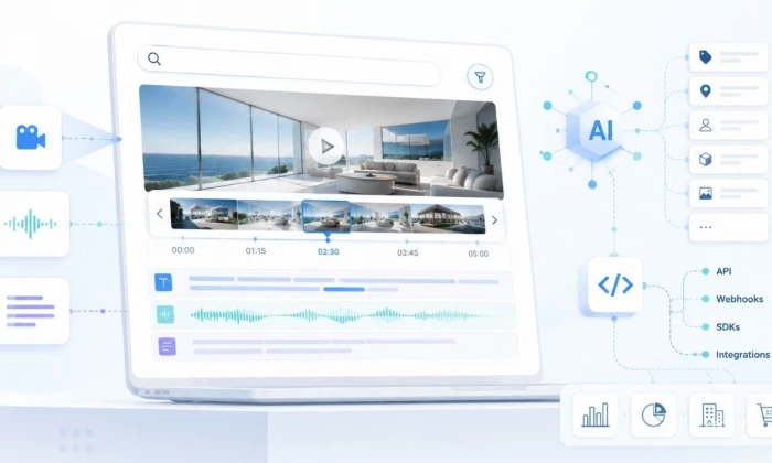
Most teams already have the video. What they do not have is a way to search it....
Mighva Verma1 week ago

IoT analytics starts with a simple problem: connected devices keep sending data,...
Vesper Barnes1 week ago
Every modern enterprise now operates two workforces. The first is the employees,...
Deepak Mehra1 month ago

Three months ago, I closed Cursor mid-sentence, downloaded a 180MB installer, an...
Sakshi Dhingra1 month ago

You've probably already read five articles trying to figure this out. I have too...
Sakshi Dhingra1 month ago

Locker manufacturing has come a long way from simple metal compartments used in...
Parveen Verma2 months ago