
A digital service does not fail only when the final outcome is poor. It often fails earlier, when a user cannot find the right entry point, submit the right information, understand the next step, or get a response before the issue becomes urgent.
That is why smart digital tools have moved from convenience features to service infrastructure. They are changing how organizations receive requests, prioritize work, support users across devices, and make help easier to reach for people who cannot depend on phone calls, office visits, or paper-heavy processes.
The first response is no longer limited to a staff member answering a phone or opening an email. In a well-designed digital service, the response begins the moment the user enters the system. A portal can guide the user, a form can check for missing details, a case system can create a record, and a notification tool can confirm receipt before a human starts detailed review.
This matters because the early stage of service is where many delays are created. If a request arrives without the right documents, the team loses time. If the request sits in a shared inbox, ownership becomes unclear. If the user receives no confirmation, they send follow-up messages that add more pressure to the same team.
Smart tools do not remove the need for human judgment. They remove the avoidable waiting that happens before judgment can be applied. The difference is that digital systems can organize the request before the specialist touches it.
A fast service experience usually depends on several tools working together. A chatbot alone cannot fix slow support. A digital form cannot improve access if it sends information into an unmonitored inbox. A dashboard cannot help if the data entering the system is incomplete.
The stronger model is a connected response layer that turns user activity into an organized workflow.
| Response layer | What it does | Why it matters |
| Digital intake | It collects user details, files, consent, and context through forms, portals, or chat. | It reduces incomplete requests and limits repeated follow-up. |
| Triage automation | It sorts requests by urgency, topic, location, risk, or deadline. | It helps time-sensitive issues move faster. |
| Case management | It gives each request an owner, status, history, and next action. | It prevents work from disappearing inside shared inboxes. |
| Notifications | It sends confirmations, reminders, missing-item alerts, and status updates. | It reduces uncertainty and unnecessary check-in messages. |
| Analytics | It tracks volume, backlog, completion rate, response time, and user drop-off. | It shows where the process is failing. |
| Human escalation | It moves complex or sensitive cases to trained staff. | It protects accountability where judgment is required. |
The value is not speed for its own sake. The value is earlier clarity. The user knows the request was received, the team knows what needs review, and managers can see where delays are forming.
Digital intake is one of the most important parts of service design. It decides whether a user can begin the process without confusion, whether the organization receives useful information, and whether the next step can happen without repeated back-and-forth.
Poor intake creates delays that often look like staffing problems. A team may appear slow because every request needs manual clarification. In reality, the system failed to ask the right questions at the start.
A strong intake flow adapts questions based on the user’s situation. If someone selects a billing issue, the system asks for transaction details. If someone reports a delivery problem, it asks for tracking information and location. If someone requests a consultation, it asks for background context, documents, dates, and preferred availability.
The best digital intake systems usually share a few practical qualities:
● They ask relevant questions based on the user’s earlier answers, so people do not have to complete a long generic form.
● They allow secure upload from a phone or computer, which reduces printing, scanning, mailing, and ordinary email attachments.
● They explain why important fields are required, so users understand the purpose of the information they are providing.
● They let users save progress when they need to gather documents, dates, photos, or account information before submitting.
● They confirm receipt immediately and explain what happens next, including whether the user should wait, upload more information, or prepare for a follow-up.
This is where response and accessibility connect. A person who cannot call during office hours, travel to a service location, print paperwork, or wait in a queue can still start the process. The service becomes reachable from more places and under more real-world conditions.
Putting a service online does not make it accessible. A portal can be available all day and still fail users if the page has poor contrast, confusing navigation, unlabeled form fields, complex language, weak mobile design, or no support for assistive technology.
The need is large. The World Health Organization estimates that 1.3 billion people experience significant disability. ITU reported about 6 billion internet users in 2025, while 2.2 billion people remained offline. These two realities should shape digital design: more people are using online services, but access is still uneven.
Accessibility also goes beyond disability. It includes users with older devices, limited data, low digital confidence, language barriers, caregiving responsibilities, irregular work hours, temporary injuries, or unreliable connectivity. A service that assumes a fast laptop, fluent language skills, and uninterrupted time excludes many people.
A practical accessibility approach should include several design choices:
● Forms should use plain language so users understand the task without needing internal knowledge of the organization.
● Buttons, links, and fields should have clear labels so screen readers and keyboard navigation can interpret them correctly.
● Error messages should explain the problem and the fix, instead of leaving users to guess what went wrong.
● Video and audio content should include captions or transcripts so users are not forced into one format.
● Lightweight pages and SMS updates should be available where connectivity or device quality may limit portal use.
Accessibility is not a final polish step. It has to influence research, design, content, development, testing, procurement, and maintenance. If a user cannot complete the task independently, the service has not worked for that user.
For many users, the phone is the main service channel. That changes the design standard.
Mobile-first design improves response because it shortens the distance between the event and the first report. A user can upload a damaged package photo from the delivery location, submit a claim image after an incident, complete medical intake before an appointment, or request support without waiting to reach a laptop.
The practical details matter. Forms should be shorter, camera upload should work smoothly, progress should save automatically, and status updates should arrive through SMS, email, or app notification.
Automation is most useful when it clears routine work that does not need human judgment. A trained staff member should not have to manually confirm every request, send every reminder, chase every missing attachment, or sort every basic category when a system can do that consistently.
The strongest automation handles predictable movement. It confirms receipt, checks required fields, routes by topic or location, flags urgent categories, sends reminders before deadlines, and escalates cases that exceed response-time targets.
This improves both speed and consistency. A manual queue depends on who opens the inbox, how they interpret the request, and how busy they are. A workflow rule creates a repeatable baseline that can be monitored and improved.
Automation should still have limits. It should not hide accountability, block escalation, or make sensitive decisions without human review. Every automated step should have clear logic, auditability, and a path for staff to override the system when context requires it.
Many organizations know users are frustrated but cannot see where the process breaks. They hear complaints, review scattered emails, and assume the answer is more staff. Sometimes staffing is the issue. Often, the larger problem is a workflow that hides delay.
Data tools make response measurable. They can show where users abandon a form, which queue has the longest backlog, which request type creates repeat contact, how long cases wait before review, and which issues are repeatedly escalated.
| Metric | What it reveals |
| Time to first response | It shows whether users are being acknowledged quickly enough after they enter the system. |
| Time to resolution | It shows whether the organization is solving the issue or only replying fast. |
| Form completion rate | It shows whether the intake flow is clear enough for users to finish. |
| Repeat-contact rate | It shows whether users are forced to chase updates or repeat information. |
| Cases without ownership | It shows whether requests are getting stuck inside the organization. |
| Accessibility defects | It shows whether users with different needs can complete the task. |
The point of data is to identify the exact friction users experience and remove it. If analytics do not lead to clearer forms, better routing, or more useful updates, the data layer is not delivering service value.
Repetition is one of the clearest signs of poor digital service. A user submits details online, repeats the same story on a call, emails the same document later, and then explains the issue again to another department. Each repetition shows that the organization’s systems are not sharing context.
Connected platforms reduce this burden. A CRM can connect with a helpdesk. A scheduling tool can connect with reminders. A secure upload portal can connect with a case file. A field-service app can update the user when work is completed. The user sees fewer steps, while the organization sees a fuller record.
This directly affects trust. Users judge an organization by whether it appears to know what has already happened. Disconnected systems make a service feel careless, even when individual employees are doing their best.
Digital access becomes even more important in services where timing, documentation, and trust shape the experience. A person may still choose a professional based on expertise and reputation, but the first impression is often formed before a conversation begins.
That pattern is visible in legal and professional services. Someone searching for a Nashua personal injury lawyer may be dealing with a time-sensitive situation, so a clear digital intake flow, secure document handling, consultation access, and prompt next-step communication can make the service feel more reachable before formal guidance begins.
Security is not separate from accessibility. Users cannot confidently upload documents, share health records, submit financial information, or provide identity details if the system feels unsafe or unclear.
IBM’s 2025 breach-cost research placed the global average cost of a data breach at 4.44 million dollars. For organizations, that cost includes investigation, recovery, lost business, legal exposure, and reputational damage. For users, the risk can include exposed addresses, medical details, identity files, financial records, or private case information.
A smart response system needs encrypted transmission, secure upload, role-based access, audit logs, identity checks, and clear retention rules. It should avoid pushing sensitive documents through ordinary email when a secure portal is more appropriate.
The balance is important. If authentication is too hard, users may abandon the process or use unsafe workarounds. If protection is too weak, the system creates risk. Good design protects sensitive information while keeping the path understandable.
AI can improve response when it is used for supervised support tasks. It can summarize long messages, classify tickets, suggest replies, translate content, detect urgency, and help staff find relevant records. These functions save time because they support the workflow rather than replacing responsibility.
The risk appears when AI becomes a barrier. A chatbot that cannot solve a problem and cannot escalate it blocks access. A generated answer that sounds confident but gives the wrong instruction creates harm. A routing model trained on incomplete data can send users down the wrong path at scale.
AI response systems need practical boundaries. Users should know when they are interacting with automation. Sensitive issues should have human escalation. Staff should be able to review AI outputs. Errors should be tracked. Personal data should be protected. The system should be tested across languages, devices, and user groups.
The useful question is not whether AI can respond. It is whether the response moves the user closer to resolution without reducing accountability.
Digital tools are more advanced, but accessibility execution remains weak. WebAIM’s million-page 2025 analysis found more than 50 million detectable accessibility errors across home pages, averaging 51 errors per page. Common issues included low contrast, missing alternative text, unlabeled inputs, empty buttons, and unclear links.
These are not cosmetic problems. A missing form label can stop a screen-reader user from submitting an application. Poor contrast can make instructions unreadable. An unclear error message can leave a user unable to fix a field.
The solution is better governance. Accessibility should be part of design reviews, content standards, development checks, procurement decisions, user testing, and post-launch monitoring. A digital service cannot be called modern if a significant share of users cannot complete the basic task.
A strong digital service feels simple because complexity is handled behind the scenes. The user does not need to understand routing rules, CRM records, access controls, workflow triggers, or analytics dashboards. They experience a clear first step, a manageable form, immediate confirmation, proactive updates, secure document handling, and a way to reach a person when the issue is complex.
Behind the scenes, the organization has ownership, routing, escalation, reporting, and quality control. That is what separates real digital transformation from a polished website attached to the same old process.
The next phase of service will not be defined by how many tools an organization buys. It will be defined by how well those tools reduce friction for the people using the service. A user should not have to understand the internal structure of an organization to get help. The system should route the request, confirm receipt, carry the record forward, and make the process usable for people with different devices, abilities, languages, schedules, and connectivity limits.
Smart digital tools improve response and accessibility when they reduce delay, improve clarity, and widen participation. Speed matters, but speed alone is not enough. The strongest organizations will use automation to remove routine friction, data to reveal bottlenecks, AI to support staff, security to protect trust, and human judgment where context matters. That combination is what turns digital access into better service.
Share your thoughts about this article.
Be the first to post a comment!
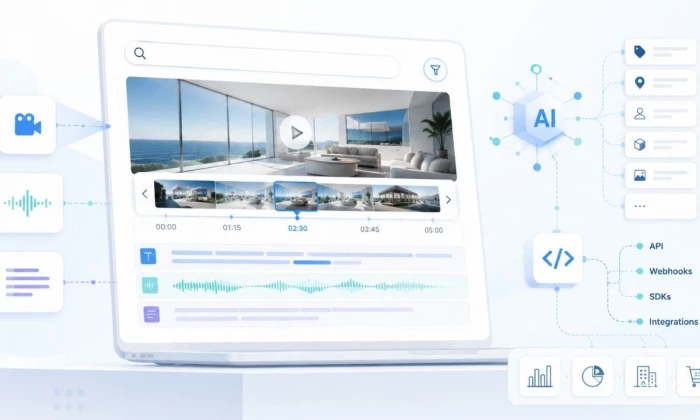
Most teams already have the video. What they do not have is a way to search it....
Mighva Verma1 week ago

IoT analytics starts with a simple problem: connected devices keep sending data,...
Vesper Barnes1 week ago
Every modern enterprise now operates two workforces. The first is the employees,...
Deepak Mehra1 month ago

Three months ago, I closed Cursor mid-sentence, downloaded a 180MB installer, an...
Sakshi Dhingra1 month ago

You've probably already read five articles trying to figure this out. I have too...
Sakshi Dhingra1 month ago

Locker manufacturing has come a long way from simple metal compartments used in...
Parveen Verma2 months ago