Most feature lists describe what a product has. The useful ones explain what it does for the buyer.
A product feature list is the short block on a product or landing page that tells buyers what the product can do. The lists that get read describe actions a buyer can picture and put them in the order buyers care about. They also drop adjectives like "advanced" or "seamless" that no buyer can check.
Most pages miss this. "Advanced analytics. Smart automation. Seamless integrations. Enterprise-grade security." Each line names something the product has, and none says what a buyer can do with it. This guide covers customer-facing feature lists rather than the internal requirement lists product teams plan with, and it works through a full rewrite of a fictional tool called TaskFlow.
1. Start with the buyer's problem and the objections that stop a purchase.
2. Rewrite each feature as a function and a benefit.
3. Order features by buyer value rather than build effort.
4. Keep each line short and specific, with verified numbers only.
5. Format the list so it scans on a phone screen.
6. Add a use case or screenshot where a feature needs context.
7. Test the list with first-time readers before publishing.
People scan web pages before deciding whether to read them. In a 1997 Nielsen Norman Group study, 79% of test users always scanned any new page, and only 16% read word by word. A 2008 NN/g analysis found visitors have time to read at most 28% of the words on an average page, and 20% is more likely (NN/g, 2008).
The habit has not faded. NN/g's 2020 review of 13 years of eyetracking studies found people still scan far more often than they read.
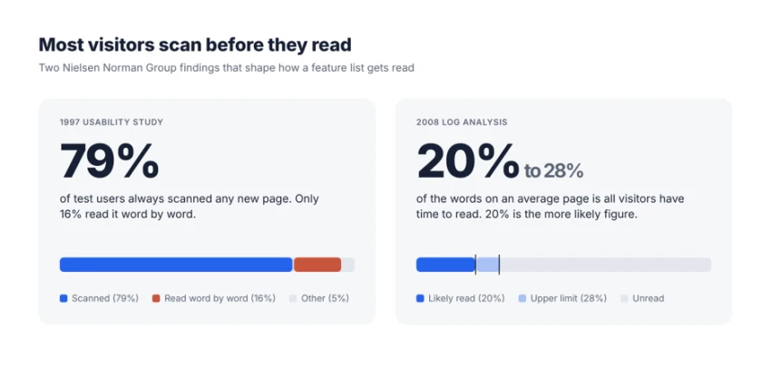
Source: Nielsen Norman Group, "How Users Read on the Web" (1997) and "How Little Do Users Read?" (2008).
A product feature list gets a few seconds of that scanning, and it usually wastes them in familiar ways:
A good list is written for one kind of buyer with one kind of problem. A handful of questions shape it.
What made them start looking? A team lead whose projects keep slipping wants different things from a freelancer who needs to invoice clients faster.
What will they use first? The first use case decides which features belong at the top.
What do they compare? Integrations with tools already in use and setup time often outweigh the feature count.
What would stop them from buying? Objections such as "our data won't transfer" deserve an answer inside the list rather than a mention three screens down.
Sales call notes, support tickets, onboarding surveys and competitor reviews hold most of these answers, and the words buyers use there often make better feature labels than anything invented internally.
Most debates about features vs benefits skip a step. Between what the product offers and why a buyer should care sits the function: what the buyer can do with the feature. Writing that middle step first keeps every benefit tied to something the product does.
Copywriters will recognise the shape from the classic FAB model, where each feature leads to an advantage and then a benefit, or from asking "so what?" until the answer matters to a buyer. Here the function plays the advantage role, phrased as an action.
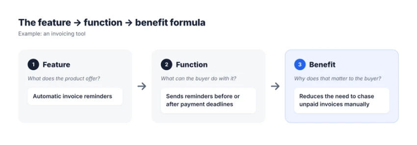
The feature → function → benefit formula, applied to an invoicing tool.
Here is the formula applied to common software features:
| Product feature | Weak description | Buyer-focused description |
|---|---|---|
| Automated reporting | Advanced reporting capabilities | Schedule reports and receive updates without preparing them manually. |
| Cloud backup | Secure cloud storage | Keep copies of your files online so they can be recovered if your device fails. |
| Team collaboration | Seamless team integration | Let teammates comment on and update shared projects in one place. |
| Custom dashboards | Powerful dashboard builder | Choose which metrics appear on your dashboard so you can check important results quickly. |
The weak versions lean on adjectives such as "advanced," "secure," "seamless" and "powerful," none of which the buyer can check. The rewrites describe an action the buyer can picture, and most address the reader as "you," which puts the product inside the buyer's own workday.
Benefits have a ceiling, though. A benefit should never promise an outcome the product cannot deliver every time. "Keep copies of your files online so they can be recovered if your device fails" is a fair line for a backup tool. "Never lose a file again" is a promise that turns one failed restore into a refund request.
Order follows buyer value, not engineering effort. The capability that took a year to build is often one buyers never look for, while a simple deadline alert might be why they signed up.
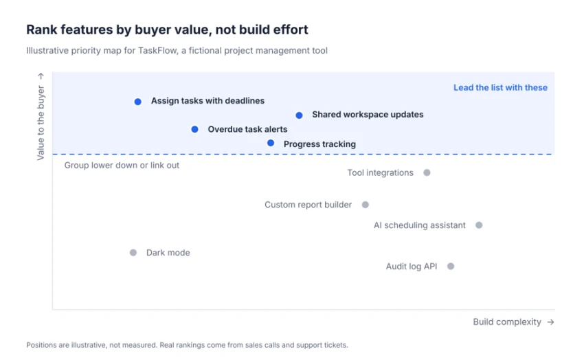
An illustrative priority map for TaskFlow. Height on the chart decides position on the page.
Products with many capabilities read better when related features sit under plain group headings, such as "Plan work," "Track progress," "Share with the team" and "Connect other tools." A buyer looking for reporting can jump straight to the right group instead of reading every line.
Items should also sit at the same level. Mixing capabilities ("Gantt charts") with plan details ("Unlimited seats on Pro") makes buyers sort the list themselves, so plan details belong in the pricing table, with a short "Pro" tag beside any feature that needs a higher plan.
Good product feature descriptions are short and specific at once. "Detailed analytics" is short but empty, while "Track overdue tasks and project progress" is a few words longer and shows what the buyer will see. Under 12 words per bullet is a workable target, since longer lines usually hold two ideas.
Objective wording has measurable value. In the 1997 NN/g study, a version written in neutral rather than promotional language scored 27% higher in measured usability, and one applying every change scored 124% higher. The test site described tourist attractions in Nebraska, so the figures show direction rather than a conversion forecast.
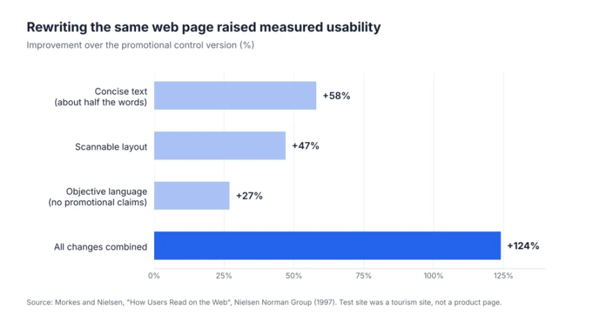
Measured usability compared with a promotional control version. Source: Morkes and Nielsen, NN/g (1997).
Each bullet should hold one idea and fit on two lines of a phone screen. Headings carry meaning on their own, so "Track progress" does more work than "Features." Whitespace between groups lets the eye find the next section without reading the last one.
Icons earn their place when they match the label, like a bell beside alerts, but they should never replace the label, since screen-reader users and fast skimmers both rely on the words. Bold text works on the first few words of a bullet and loses its effect across whole sentences.
Most layout problems show up first on mobile. A wide comparison grid that reads well on a laptop becomes a sideways scroll on a phone, and a quick preview on a small screen catches it before publishing.
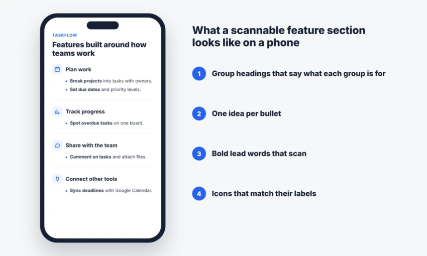
A TaskFlow feature section built for small screens.
Use cases do what descriptions cannot: they show a feature at work. "Get alerts when a task needs attention" becomes much clearer with one line of context: when a design review runs two days late, the project lead gets a notification.
A one-line scenario under a feature group, written around a named role such as "agency project manager," often does the job without bloating the list. Features that involve movement, such as drag-and-drop scheduling, suit a short clip, while a cropped, captioned screenshot covers most others. Links to full demos belong after the description, not in place of it.
Screenshots must match the current interface. An outdated one makes buyers wonder what else on the page is stale.
A finished list still needs checking against real readers. These methods cover most situations:
| Method | What it shows | Best for |
|---|---|---|
| Five-second test or short usability session | Whether a first-time reader can say what the product does after a quick look | Any page, including new launches |
| Customer and sales feedback | Which questions buyers still ask that the list should already answer | Products with active sales or support teams |
| Neighbour test | Whether a reader can explain how two adjacent features differ | Lists with similar-sounding items |
| Page analytics | Scroll depth and clicks on feature sections or demo links | Pages with steady traffic |
| A/B testing | Whether a rewritten list changes sign-ups or demo requests | Pages with enough traffic for a reliable result |
A/B tests need traffic and patience, and on a low-traffic page a test can run for weeks without a clear answer. There, sessions with five real prospects often reveal more about confusing wording, in line with NN/g's advice to test five participants per round.
The two feature list examples below show a typical TaskFlow list and a rewrite that applies every step above.
BEFORE Our features Advanced task management Real-time collaboration Smart notifications Detailed analytics Seamless integrations | AFTER Keep projects moving Assign tasks with owners and deadlines. See teammates' updates in one shared workspace. Get alerts when a task needs attention. Track overdue tasks and project progress. Connect supported work tools. |
What changed:
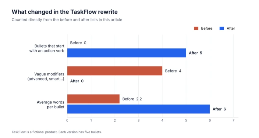
The measurable differences between the two TaskFlow lists.
The new version is longer, yet every added word carries information, and "Connect supported work tools" admits a limit that "seamless integrations" glossed over. TaskFlow is fictional, so these capabilities are illustrative rather than verified claims.
Two well-known software pages show these principles at different scales. Both were checked in November 2026, and feature pages change often.
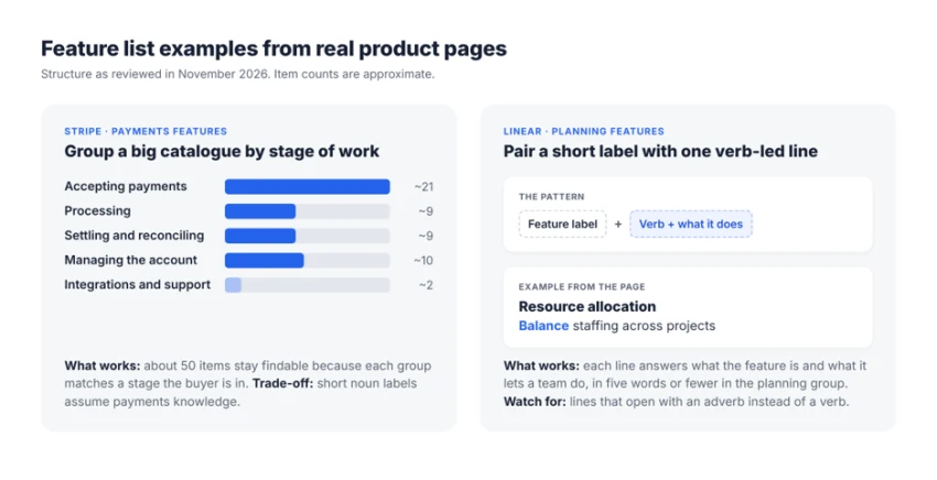
How Stripe and Linear structure their feature lists, as of November 2026.
Stripe groups a large catalogue by workflow. Stripe's payments features page holds roughly 50 items, far too many for one list, so it sorts them by stage of work: accepting payments, processing them, settling and reconciling the money, and managing the account . Each subgroup opens with a heading and a sentence of context. The labels underneath are short nouns that assume payments knowledge, which suits developers but would lose a general buyer.
Linear pairs a short label with one action. Linear's planning page gives each feature a short label and a line that usually opens with a verb, such as “Resource allocation: Balance staffing across projects”. Its visual planning lines manage this in five words or fewer. One item elsewhere opens with an adverb instead, a reminder that even careful lists drift toward filler.
The same method works for physical products, where feature lists usually appear as short bullets beside the product photos. On Amazon, sellers can write up to five bullets per listing , so each bullet has to carry one feature and its benefit. A common format leads with the feature in bold and follows it with the benefit in plain words.
BEFORE Insulated water bottle Premium quality Advanced insulation Leak-proof design Eco-friendly materials Perfect for everyday use | AFTER Insulated water bottle Double-wall insulation: keeps drinks cold for 24 hours in the maker's own tests. Screw-top lid: rides on its side in a bag without leaking. Slim base: fits most car and bike cup holders. Dishwasher-safe body: goes on the top rack; the lid is hand-wash only. 750 ml capacity: holds about three standard glasses of water. |
The bottle is fictional, and its figures are placeholders. In a real listing, every number has to come from the product's own testing and stay true for every variant sold under that listing.
Overpromising. "Never miss a deadline" sets an expectation no tool can meet, while "Get alerts before deadlines" describes what the tool does.
Excessive adjectives. Stacking "powerful, intuitive, flexible, all-in-one" signals the writer had nothing specific to say.
Unverified claims. Lines like "saves 10 hours a week" or "bank-level security" need a source or a test behind them, or they come out.
Buried limitations. When a feature needs a higher plan and the list says nothing, buyers who find out after signing up tend to cancel.
Repeated benefits. When "save time" appears under five features, it stops meaning anything.
CHECKLIST Is your feature list ready to publish? ☐ The most important features appear first. ☐ Each description explains a concrete capability. ☐ Technical terms are explained where necessary. ☐ Benefits are tied to realistic buyer needs. ☐ Unverified performance or security claims are removed. ☐ The list is easy to scan on mobile. ☐ A reader unfamiliar with the product can understand it. Score: ____ / 7 |
The quickest place to practise writing product features this way is an existing list. The highest-traffic product page is a good candidate, and its five most important features are enough for a first rewrite.
The final check needs readers who have never used the product. If they can explain what it does after one read, the list is ready.
Share your thoughts about this article.
Be the first to post a comment!

A negative review is rarely a conversation with the person who wrote it. It is a...
Sakshi Dhingra2 weeks ago

The short answerTo be cited, your page must first be retrievable (ChatGPT reads...
Sakshi Dhingra1 month ago

One red warning page can empty your traffic overnight. Here is how blacklists wo...
Deepak Mehra1 month ago

Relay.app spent five years building AI-powered workflow automation as an alterna...
Sakshi Dhingra1 month ago